A new identity for a conceptual lifestyle brand. This brand, inspired by bees and honey, is an identity that advocate natural solutions for healing, relief and self-care.

b:
b:
A contemporary lifestyle brand that market products and offer services for the revitalization, rehabilitation and recovery of the body after strenous exercises. Unlike most active lifestyle brands that focuses on retailing sporting apparel and/or products for the outdoors, b: takes on a different perspective by using bee products to create remedies and provide services that help maintain one's body conditions after strenous physical activities. Thus, this identity reflects the encouragement to empower and engage self-care and recovery through a friendly, quirky, yet calm tone of voice.
TYPE
School Project, 2019
CATEGORY
Corporate Identity
MY ROLE
Brand Identity + Strategy, Research, Conceptualising, Copywriting
TOOLS USED
Illustrator, InDesign, Sketch, After Effects, Photoshop
CASE STUDY OVERVIEW
To develop a new dynamic identity for a conceptual brand of choice, explore brand strategies presented on print and digital assets, and understanding design requirements for brand identity guidelines.


b: guided
A brand guide book designed for users to b: guided on brand implementation implemention onto different mediums, while allowing and encouraging creative freedom within the restrictions provided.


THE BRAND
Inspired by the bee and healing crystals, the brand is versatile, minimal, contemporary, engaging, quirky, friendly, and dynamic.
The three-dimensional nature of the mark is a reflection of the multi-faceted personalities the bee encompasses representing the company's multi-faceted services and products. Its crystal like form is a reference to a healing crystal, reflecting the company's mission of providing active lifestyle seekers with natural solutions for revitalisation and self-care.


BRAND APPLICATION
Print collateral and packaging utilizes the singular honey yellow colour and dynamic logotype naming system to be the forefront of the brand's visual identity, as seen through the mockups below.


PROCESS & INSIGHTS
This section is a detailed account of the brand development, entailing various stages, starting from brainstorming ideas to decide what type of company I wanted to brand, conceptualising what the brand is about to creating a final logo for the chosen conceptual company. Challenges were encountered throughout the development process, but also led to insights that solved the encountered problems.
BACKGROUND
The scope of this school project was to develop an identity for a conceptual start-up company / business of choice to understand the importance of business strategies in brand building. This project purposefully encouraged to teach the vital roles strategy and identity play when developing a brand.
The starting point for this project was to come up with a business idea which the sector of the start-up business falls under a generic group. Once decided on the business idea, the next step was to conduct market and competitor research to aid in creating a brand foundation and mission statement before moving on to developing the logo mark and brand identity. The final project deliverables were to design a brand style guide book according to the needs of the business model that include mockups and a brand site.
Phase 1: Brainstorming & Research
Conducted in collaboration with my phase 1 partner Melosha Ratnasingham, we worked together to come up with and conceptualise start-up business ideas. We tried to explore different business sectors and ideas such as technology, education, health, sustainability, etc. Once narrowed down on the business ideas, and deciding on chosen niche market, competitor research, business analysing techinique (SWOT analysis) were conducted.
1A. BRAINSTORMING
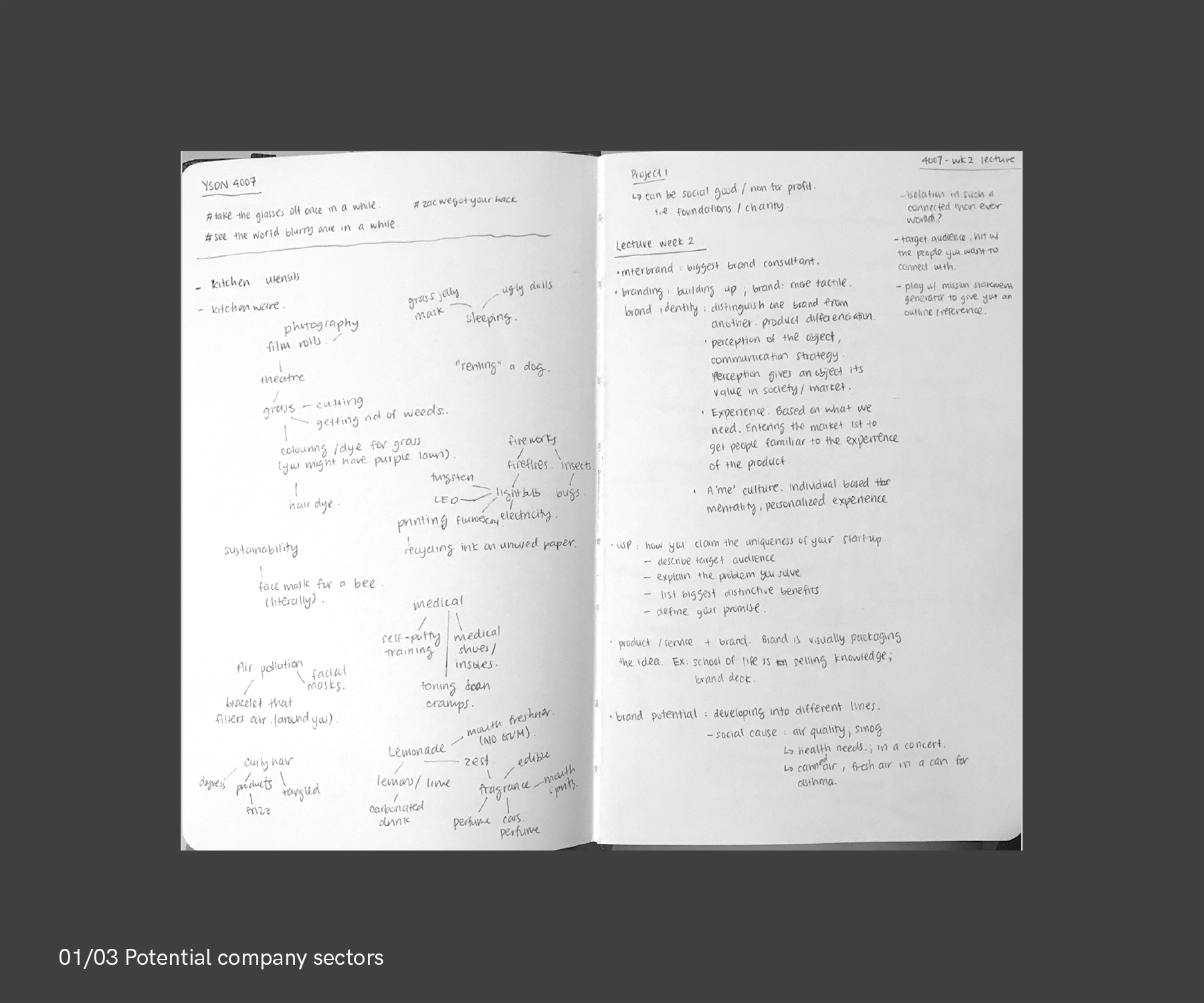
[01/03 POTENTIAL COMPANY SECTORS]:
Initial and early stage of broad brainstorming for potential start-up busines ideas that we could create and develop a brand for. By selecting to narrow down on a business sector we then develop the company profile and determine what type of company it is.
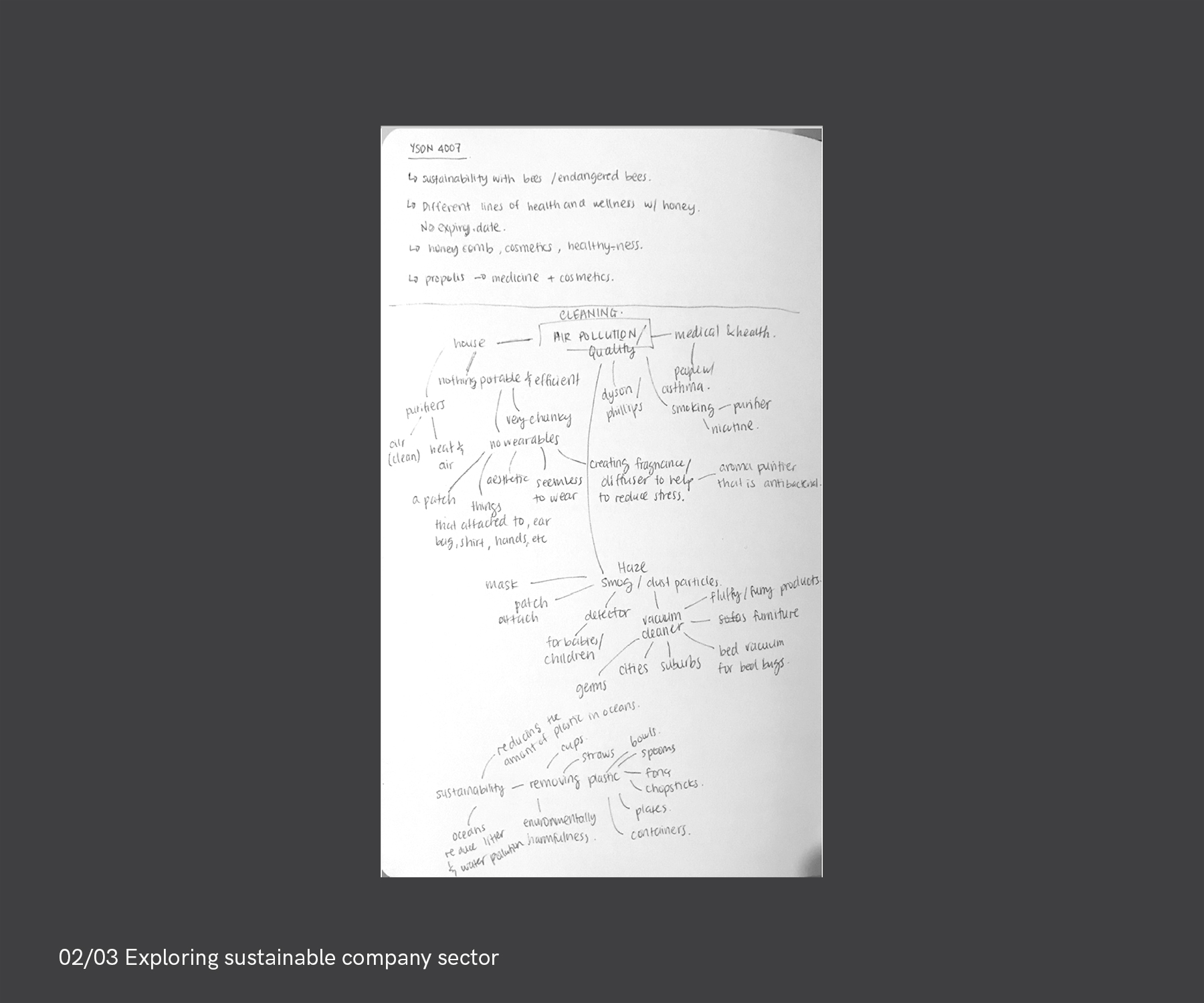
[02/03 EXPLORING SUSTAINABLE COMPANY SECTOR]:
Exploring sectors in environment, sustainability, and health through problems that we see happening right now. Looking into these problems could lead to a business idea that develop or retail products to combat and find a solution to problems experienced by people.
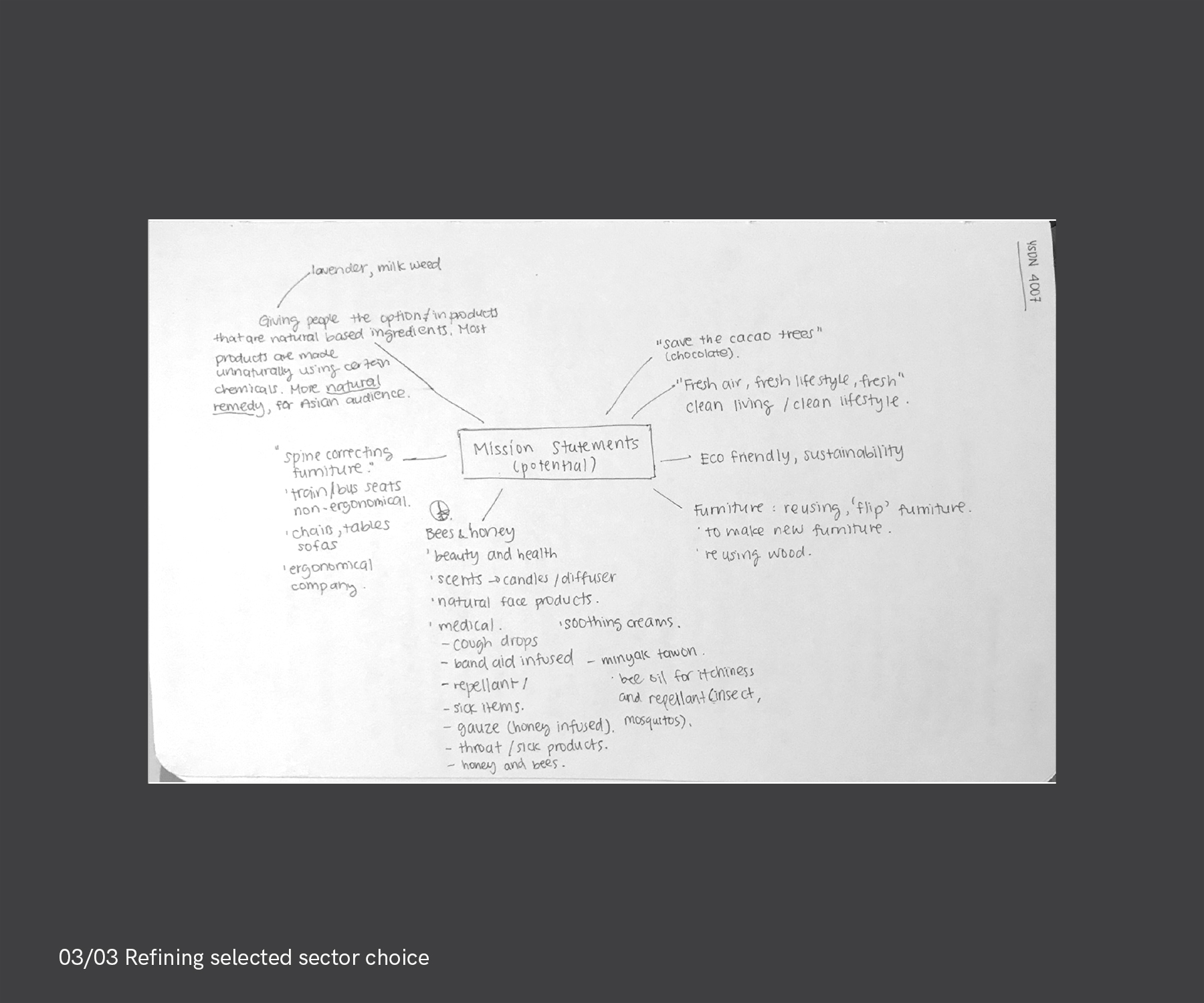
[03/03 REFINING SELECTED SECTOR CHOICE]:
Narrowing down the ideas to broad groups: bees and honey, ergonomics, nature and sustainability. We decided to respectively create a business idea under the broad umbrella of bees and honey. Thus, the business idea will be related to or inspired by bees and honey.
1B. RESEARCH
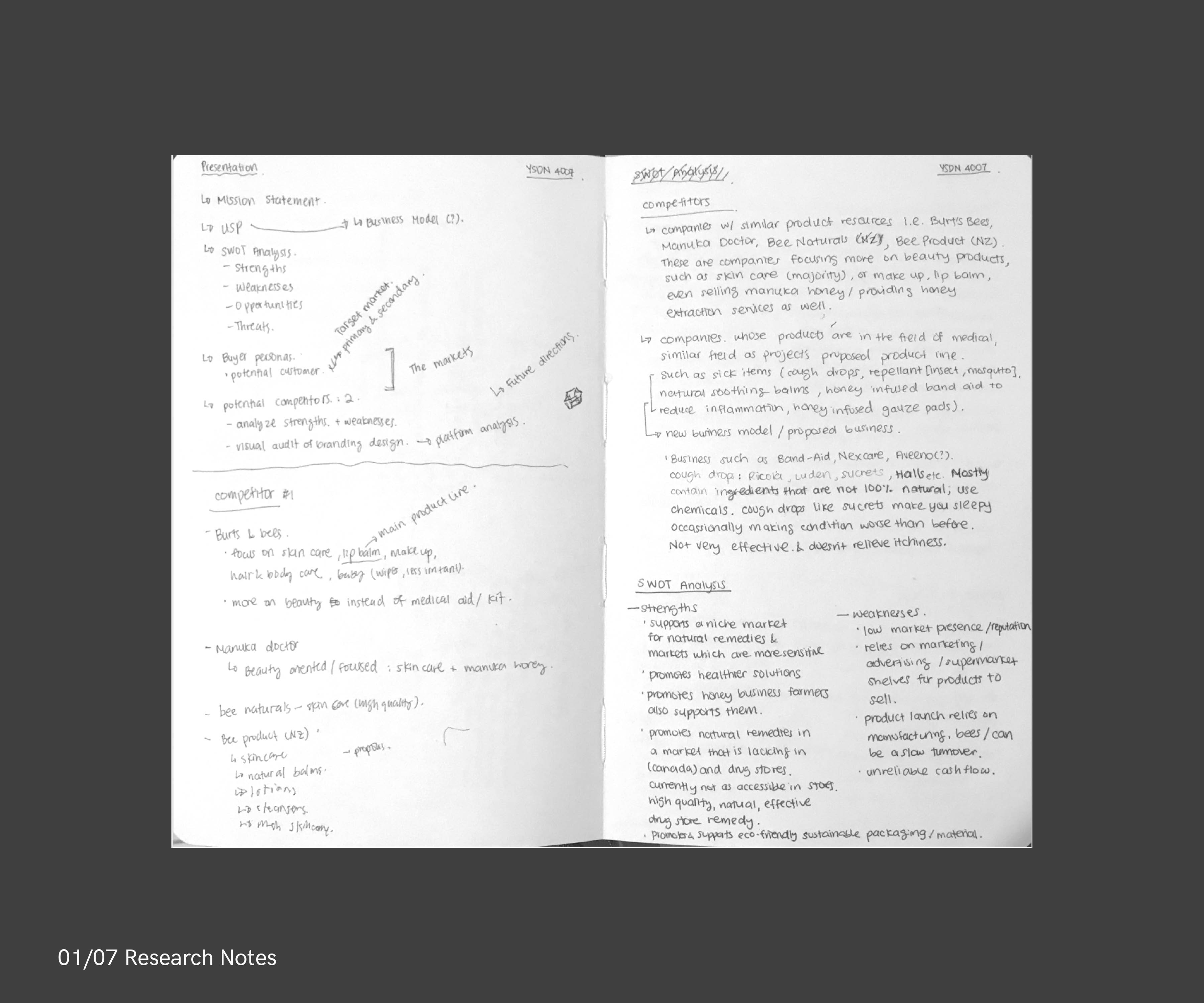
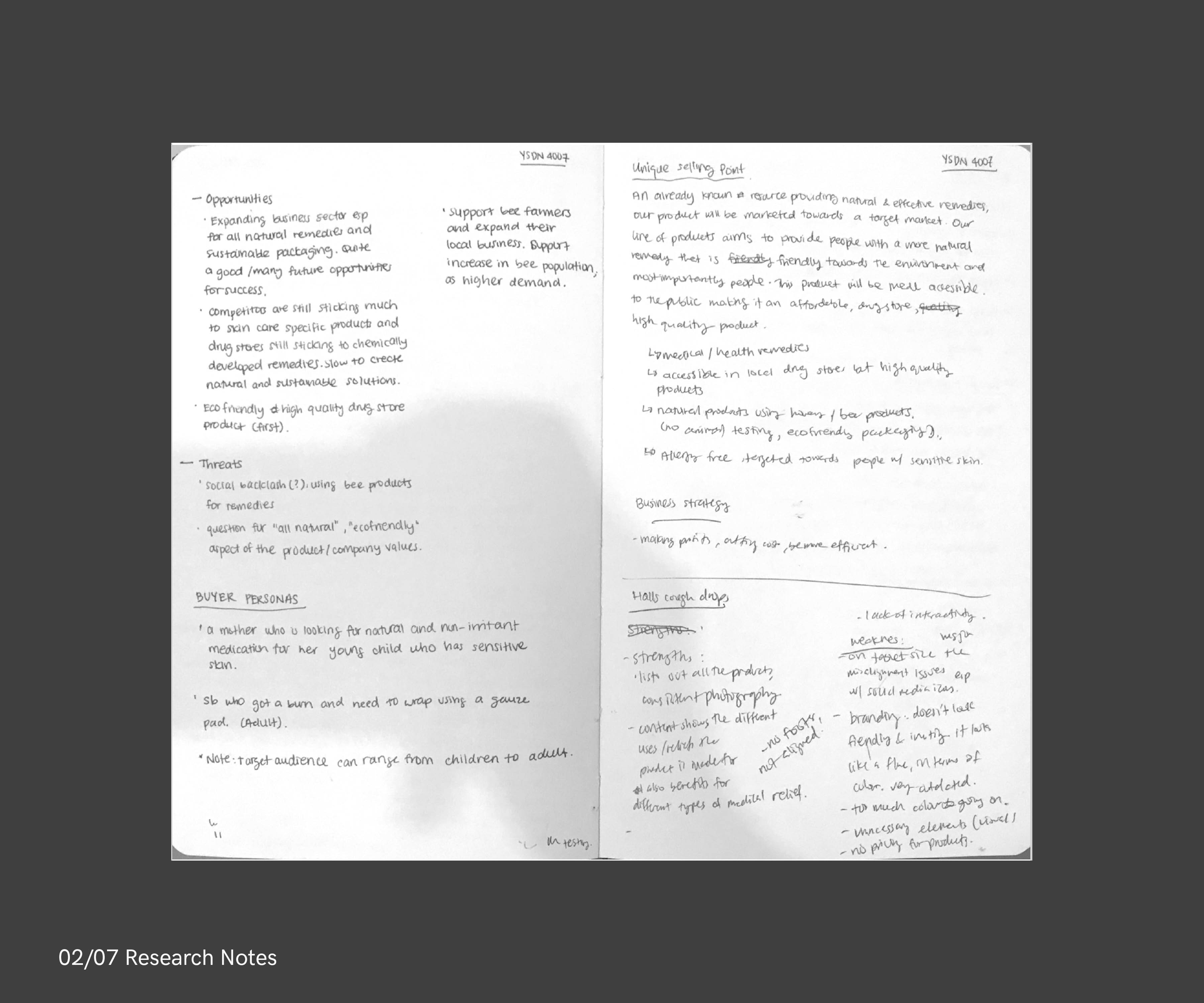
[01-02/07 RESEARCH NOTES]:
Based on the business model analysis technique, these research notes are information gathered regarding businesses that are already on the market who retails bee related products, or services that relate health, lifestyle, honey and bees in general.
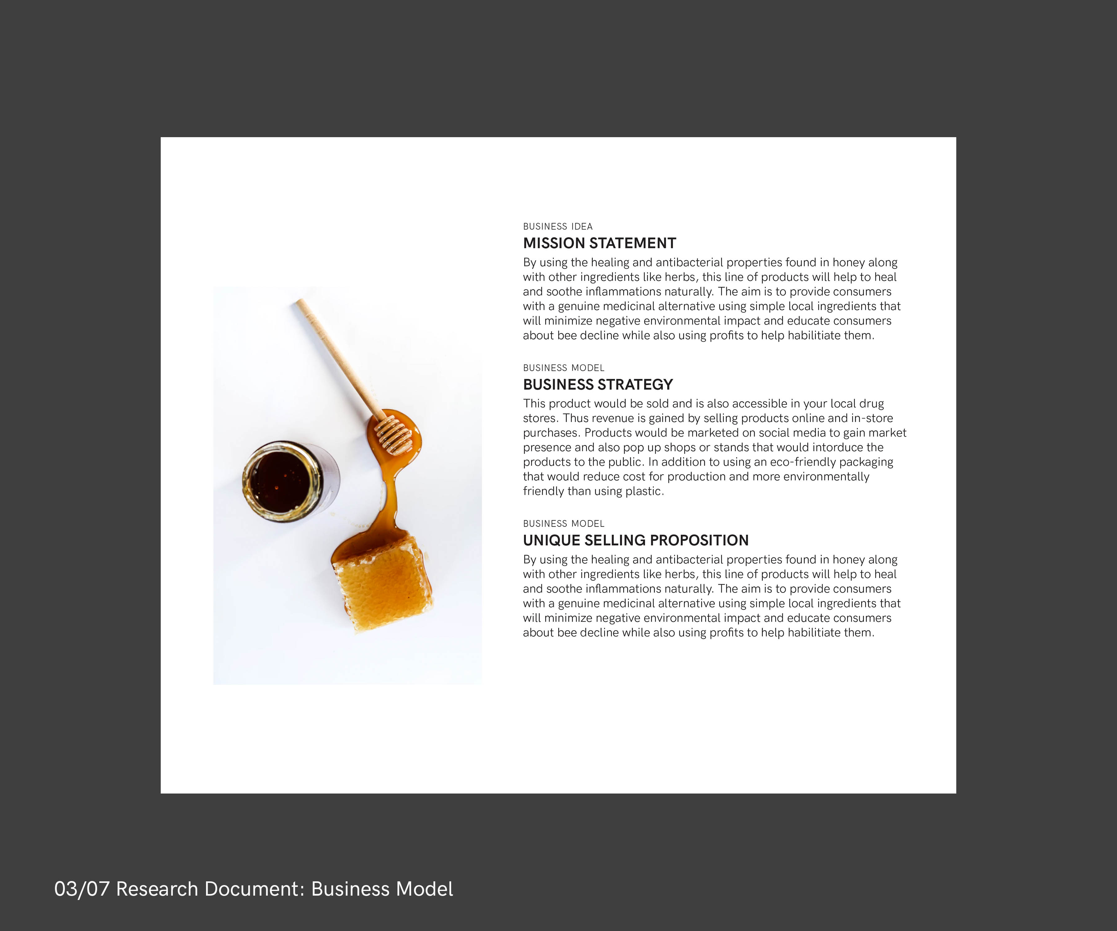
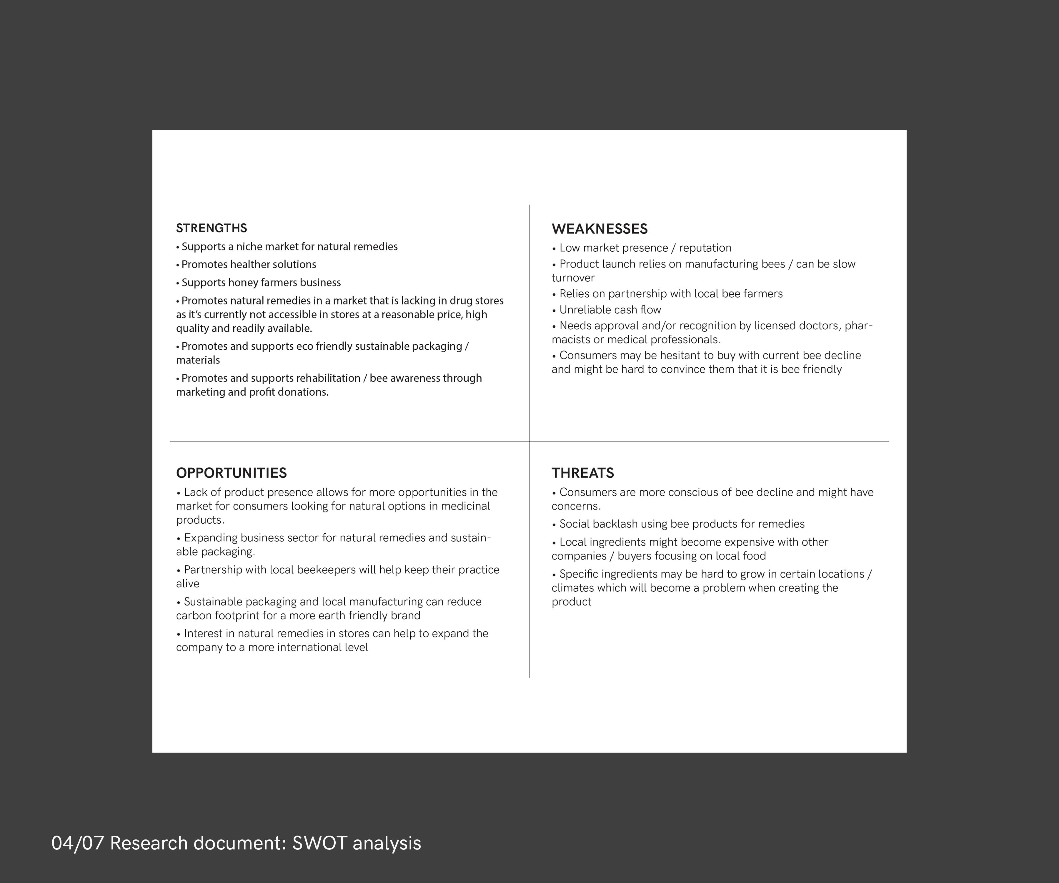
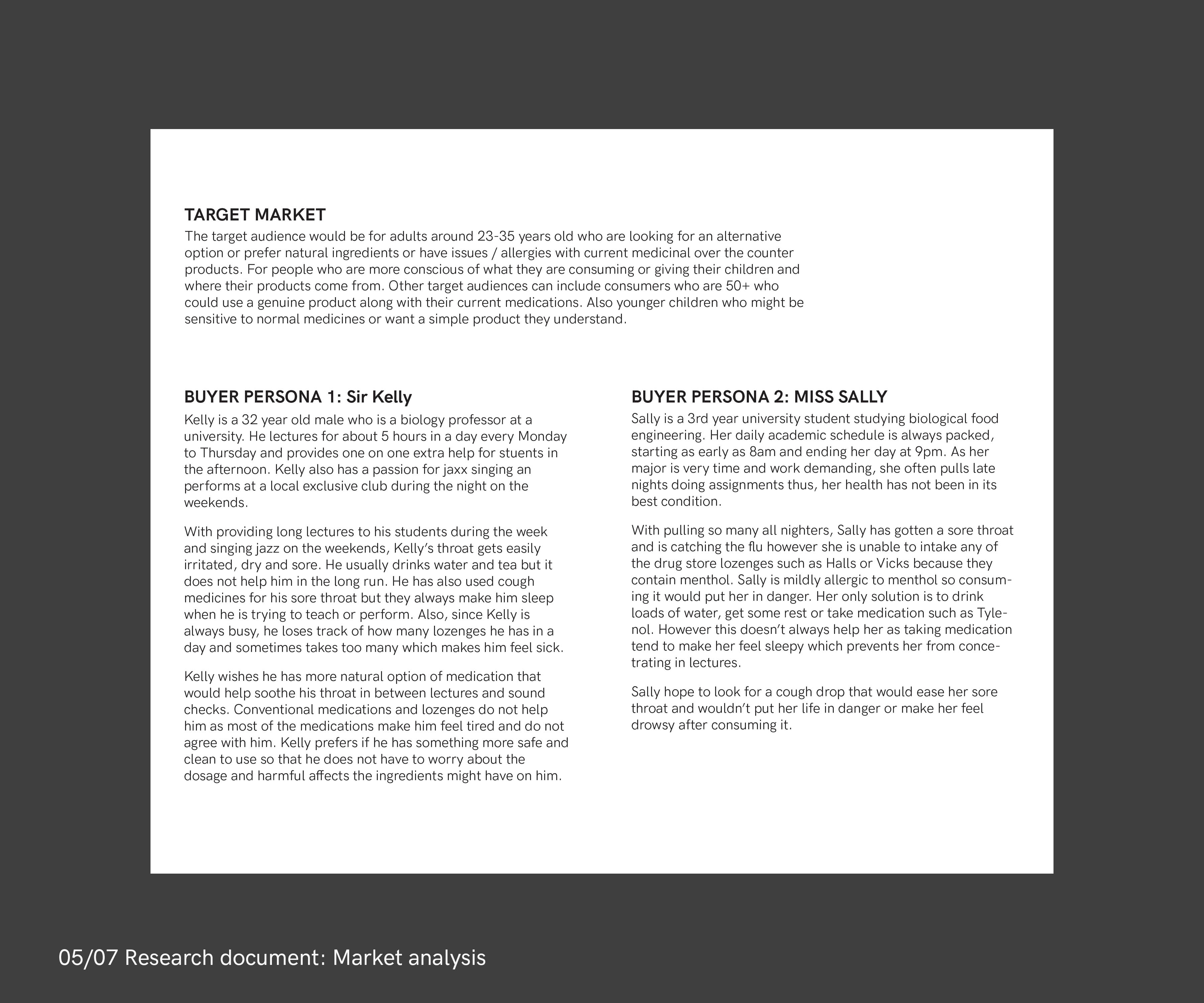
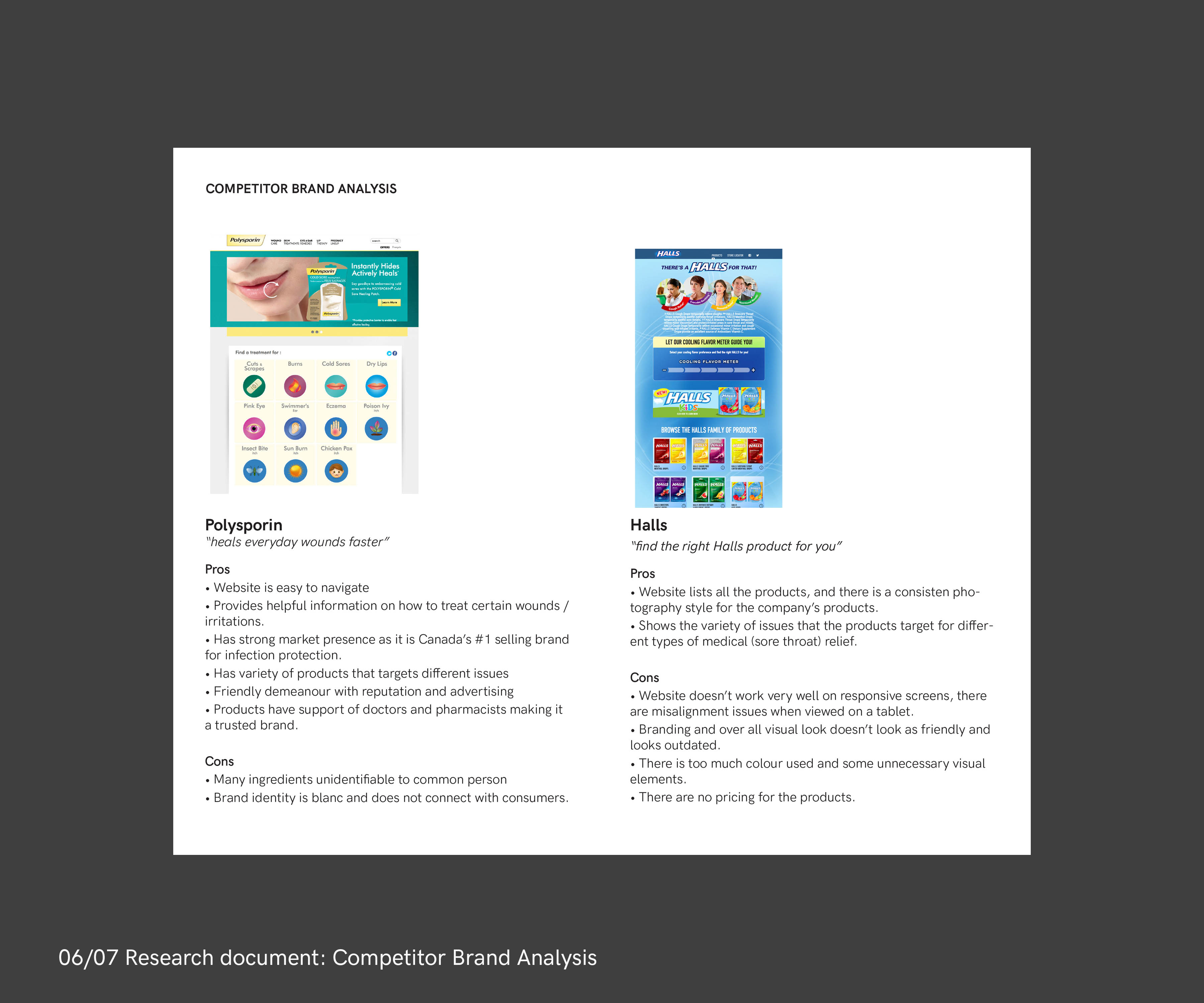
[03-06/07 RESEARCH DOCUMENT]:
The presentation pitch of the business idea that we agreed to build the company and develop a brand from: bees and honey. The research document focused on competitor analysis in the niche market of sore throat remedies people purchase when they feel unwell such as Halls or Polysporin.
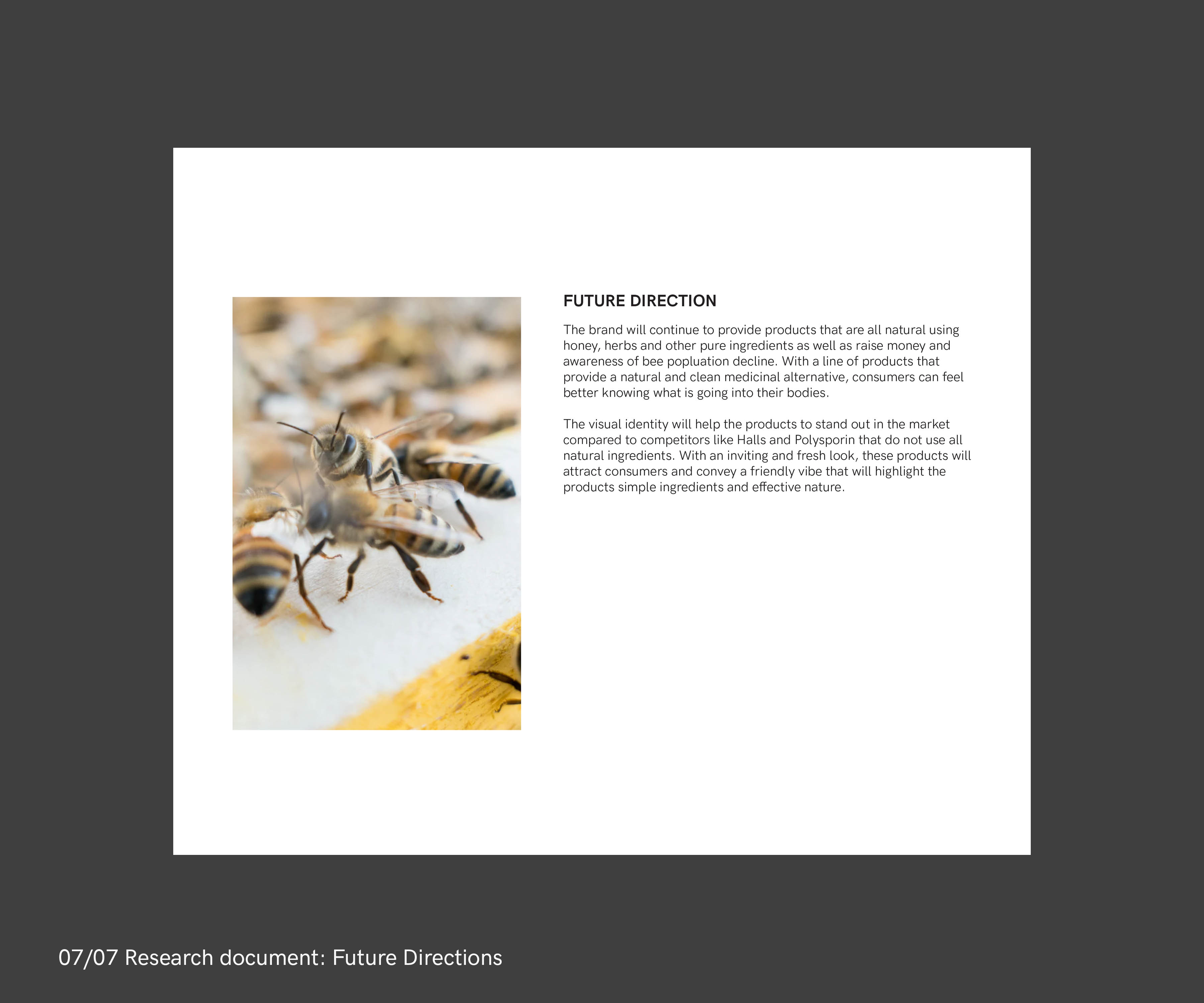
[07/07 FUTURE DIRECTIONS]:
This is a plan of where we can take the concept of the company and the brand but it is not set in stone. There are changes that could be made to refine the idea depending on the direction we each wanted to take given the general theme of bees and honey.
Phase 2: Brand Story Development
The brand story concept branches off from the phase 1 idea of health, healing, and medication using bee or honey products. The focus was not necessarily on remedies for sore throats or skin care as the typical bee products currently out in the market as planned in phase 1. Instead the company will focus on creating remedies that would help heal sore muscle aches / pains, and maintain optimal bodily conditions and aid recovery after strenous exercises.
! PROBLEM
During the brand story refinement (2B), I incorporated other health related remedies such as essential oils and trying to force that idea in led myself into confusion and losing focus resulting in a formulated problem. This led to a clarity block to put the story into coherent sentences. Having difficulty to set the language of the brand led to a constant change in concept and also had a negative effect on designing the logo mark as the logo and brand story were in development simultaneously.
✳︎ INSIGHTS
Realising that I was steering away from the core idea led me to stop and reflect upon it. Asking myself important questions such as what is this company actually about? What is it trying to actually do? What kind of impression would I want people to have when they come across this brand, thus how might we then convey the personality and values with words?
2A. BRAND STORY DEVELOPMENT
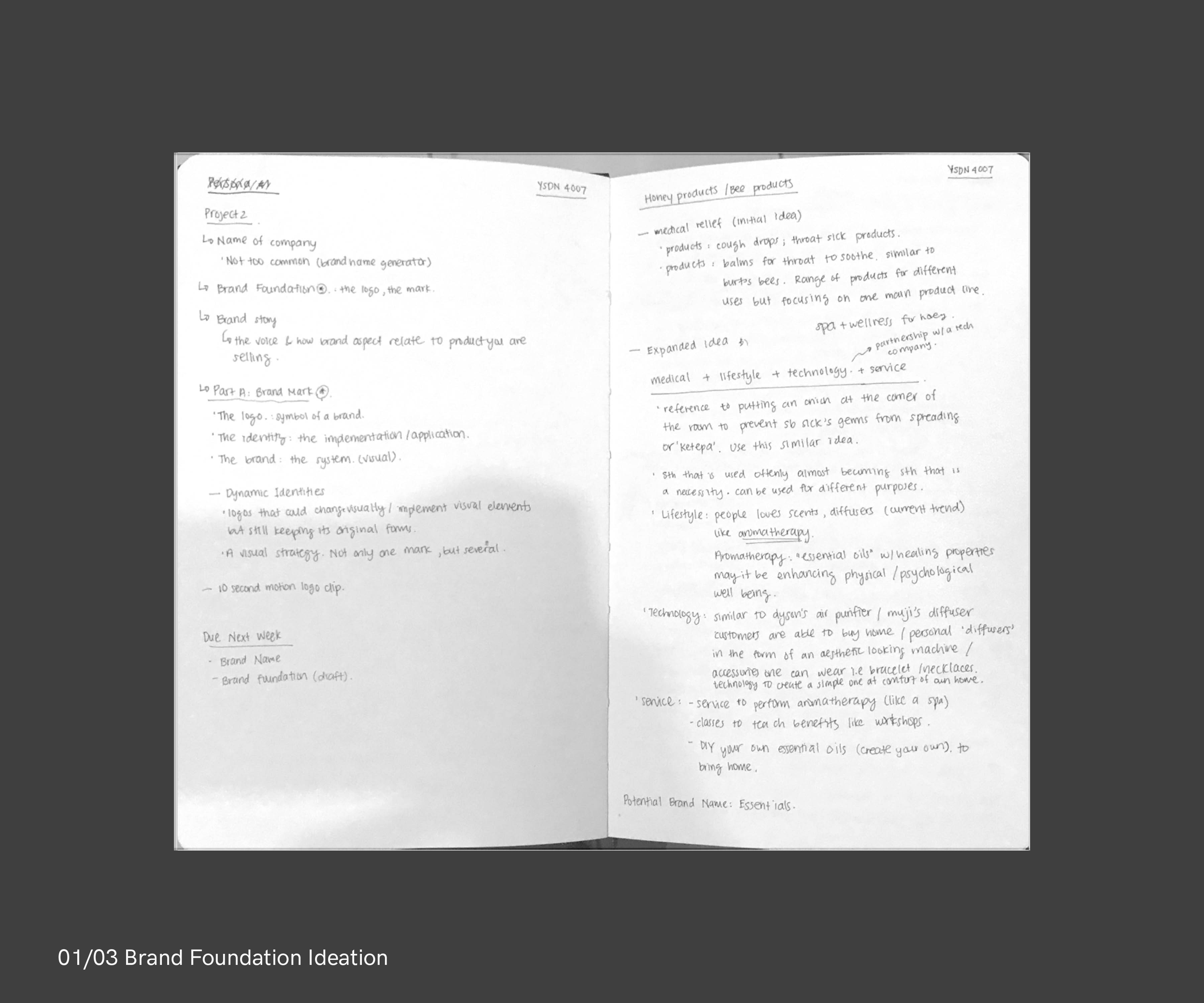
[01/03 BRAND FOUNDATION IDEATION]:
Noting down thoughts and concepts of what industry this start-up company is categorized as. One idea is a hybrid of lifestyle and medical products and services.
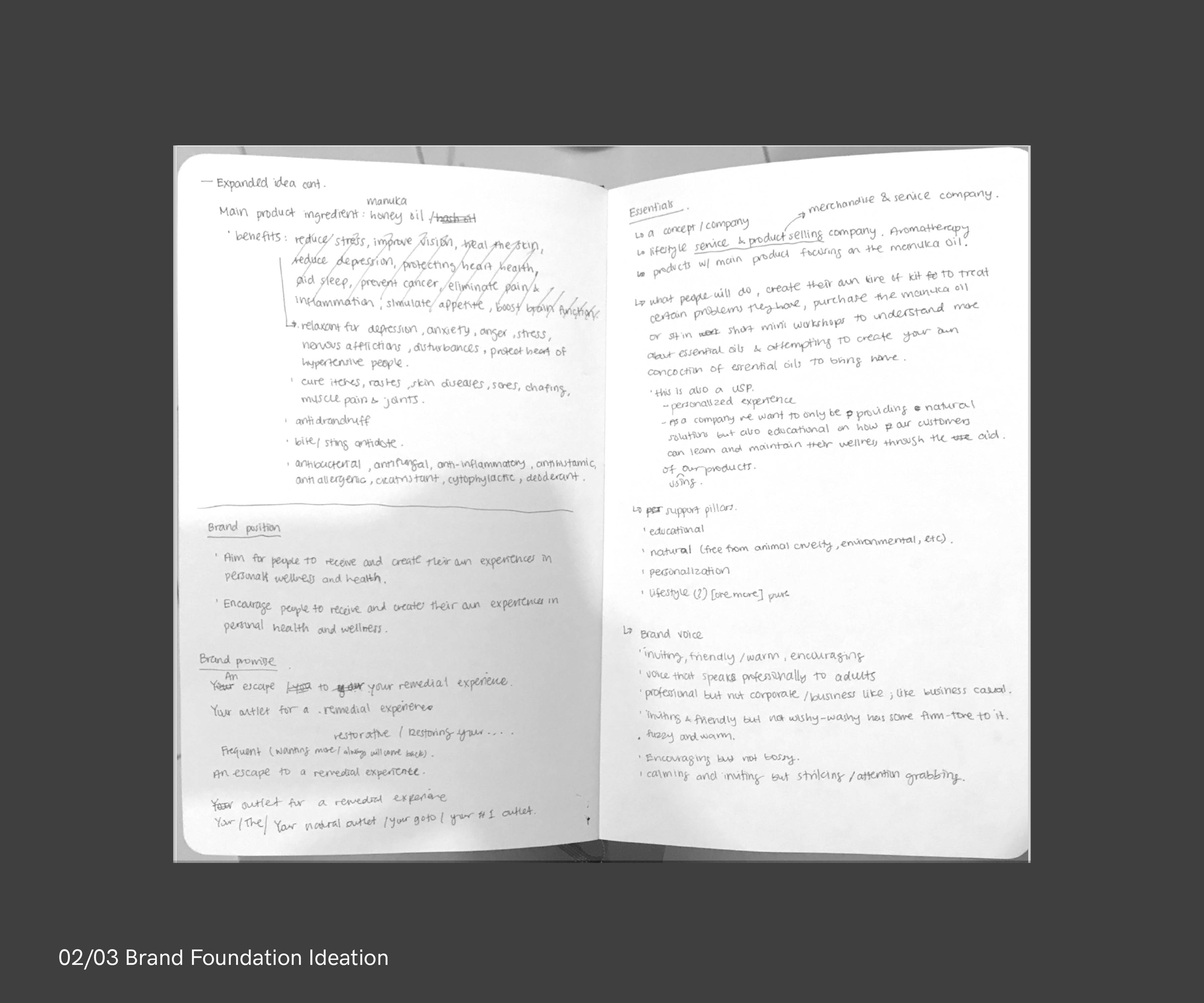
[02/03 BRAND FOUNDATION IDEATION]:
Planning and putting ideas into words of the start-up company's brand foundation, mission statement. Basically the "About" page of the company.
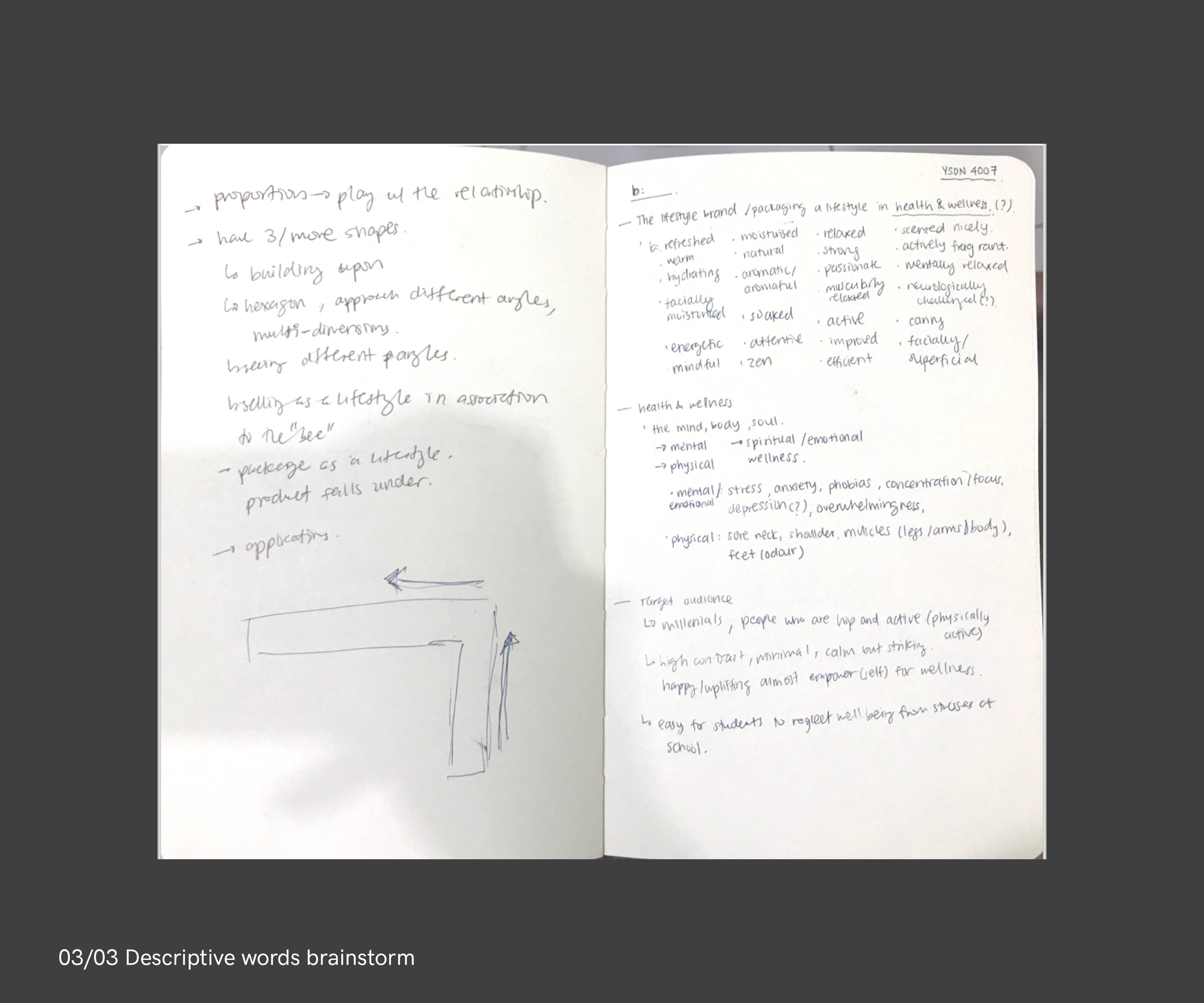
[03/03 DESCRIPTIVE WORDS BRAINSTORM]:
I know that I wanted the brand to be dynamic not only through the logo mark but also through the logotype. Adjectives are listed to use them words of empowerment, or a one-word description about the company or potential products or services. Keywords associated with the company are also noted.
2B. BRAND STORY REFINEMENT
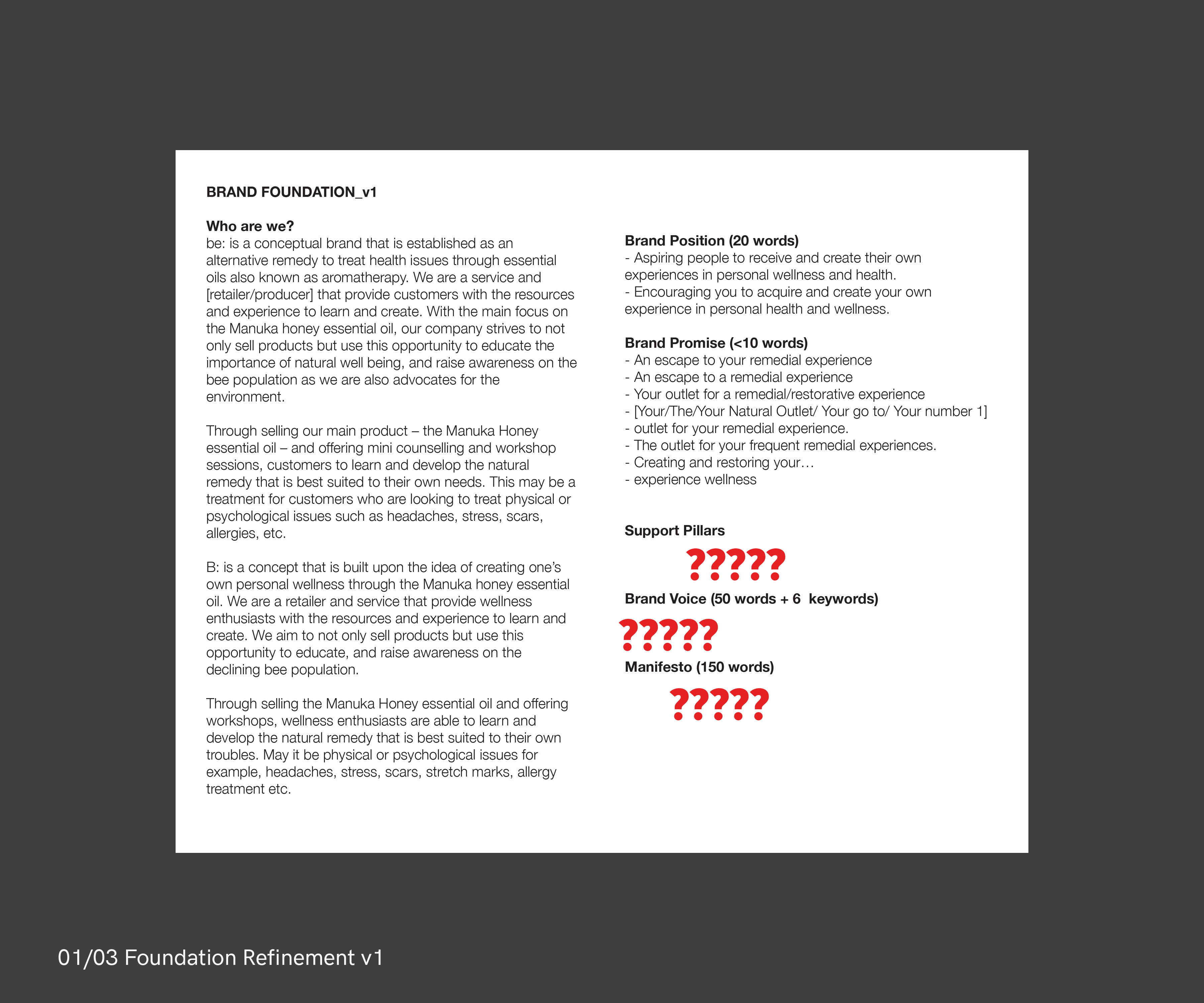
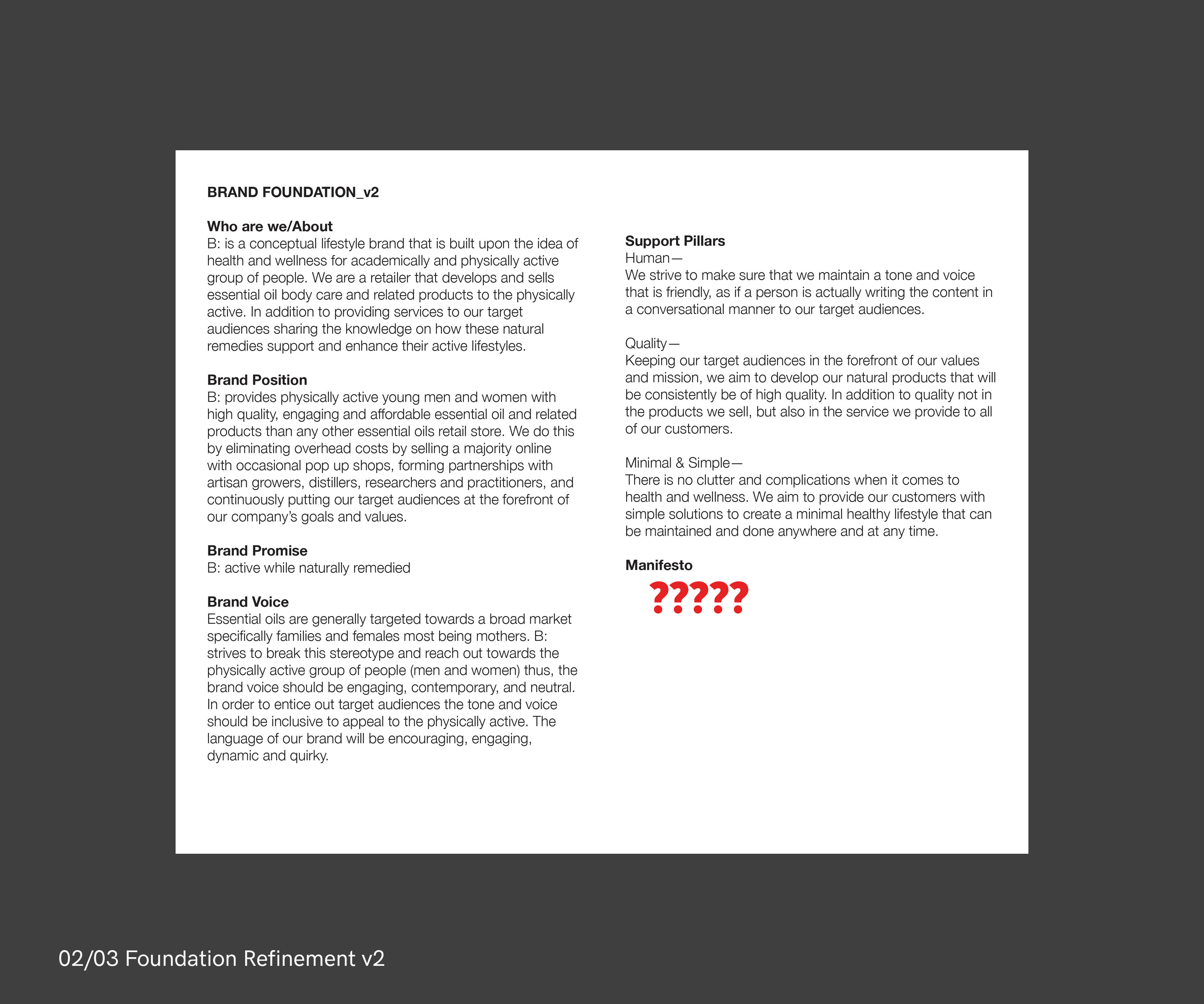
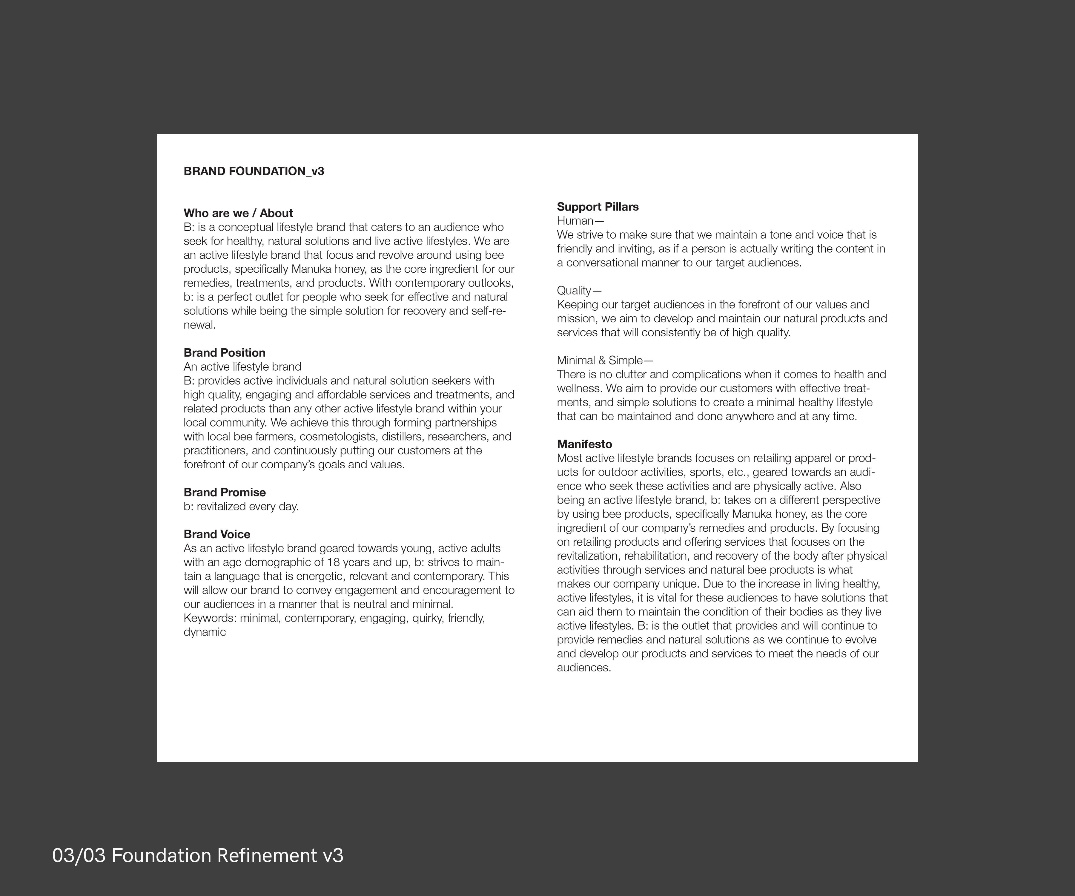
[01-03/03 FOUNDATION REFINEMENTS]:
3 of the many rounds of revisions and refinement of the brand foundation. Honing in on the brand foundation and writing the mission statement was a challenge and took time to develop.
Phase 3: Logo Development Round 1
This first round was a lot of brainstorming and exploring the various ideas based on the themed concept chosen in phase 1, bees and honey. From the start, I tried to think about ways on creating the dynamic aspect of a logo mark. This was a challenge as I wasn't able to fully grasp the meaning and different type of dynamic identities, but coming across a Medium article[↗︎] written by Paul Davis played a huge role in helping the logo development process.
I only selected a few of the ideations to explore digitally, ones that I thought would have greater potential for creating a dynamic identity. But given this limitation that I set for myself, I ran into a problem. During this phase the name of the company was also in development and there were a few iterations before deciding with the final company name, b:.
!PROBLEM
It wasn't working. There was too much focus on trying to create a dynamic identity that I forgot on building a strong concept for the logo first before thinking on how to make it dynamic once the concept is decided. There was a lot of investment in trying to create a symbol of honey dripping (see digital explorations) out of geometric shapes that it simply looked like tetris and did not convey a 'honey drip'.
✳︎ INSIGHTS
Scrapping all this first logo phase and taking it back to the basic element that we usually relate to bees. Honey, honeycomb which are formed by assembling hexagons. The refocusing was on the brand mission statement and what this company is about which is using the inspiration of honey to create a brand that heals. Word to object associations helped with a new concept: hexagons make up the honeycomb, and healing crystals representing revitalization and healing.
3A. IDEATION & SKETCHES
[01/10 IDEATION ROUND 1]:
Exploring 2D and 3D geometric shapes (square, cube, hexagon) and thinking about the dynamic container identity.
[02/10 IDEATION ROUND 2]:
Exploring the mark as a logotype, how the form of the letter 'e' or 'B' can illustrate the generic shape of the bee. Also exploring how diacritics can serve as the dynamic identity that symbolise the bee antenna which can be placed above a letter or different shapes.
[03/10 IDEATION ROUND 3]:
Exploring how the hexagon shape could take the form of the letter 'e' and also look like a bee. The dynamic identity exploration was also how the bee's body could be represented by different shapes.
[04/10 BRAINSTORMING WORD ASSOCIATION]:
Brainstorming session of words that associated with bee, honey, health, lifestyle to help me come up with the company name. Wanted to come up with something simple yet smart; some options were 'bee', 'be:', or 'bumble'.
[05/10 IDEATION ROUND 4]:
This round of ideation is inspired by the potential company names selected through the brainstorm session. It focuses on exploring the letter 'b' and how the counter of the letter can be the formulative dynamic identity. I also explored using a brush pen to achieve a more organic aesthetic.
[06/10 IDEATION ROUND 5]:
Further exploring the hexagon shape and using it as a container while the centre illustrates varying patterns to create the dynamic identity.
[07-08/10 IDEATION ROUND 6 + EXPLORATIONS]:
Exploring the square as the container (instead of the hexagon) while the centre illustrates varying patterns. Also exploring the assembly of the square to create different forms, and the geometric combination began to look like dripping honey.
[09-10/10 IDEATION 6 DYNAMIC EXPLORATIONS]:
Exploring the square and rectangle combinations to create varying ways of 'drips' in geometric form.
3B. DIGITAL EXPLORATIONS
[01-02/16 IDEATION ROUNDS 1 & 3]:
Digitally exploring the ideation sketches from round 1, 3, 5. Seeing how the sketches look like with a more restricted, and mechanised feel. The shapes of focused were the square, rectangle and hexagon.
[03-04/16 DYNAMIC WORD EXPLORATION]:
Exploring how the logo would be a logotype and how punctuation to relay and create meaning to the word 'be'. How the word 'be' could be replace with a square and if it gives the same meaning. Also exploring the use of bilingual adjectives to create the dynamic identity of the company 'be'.
[05/16 TYPEFACE EXPLORATION]:
Searching various typefaces that would be most fitting for the primary typeface. From the start the selected font would be sans serif as it would give a cleaner look.
[06-08/16 IDEATION ROUND 6 EXPLORATION]:
Inspired from tetris block, I explored how a basic 4-sided shape are assembled to create a larger shape that mimics the drip of honey but in geometric and more rigid form. I explored the different stroke textures and using different patterns to create the dynamic portion of the mark.
[09-10/16 GEOMETRIC EXPLORATION 1 & 2]:
Exploring 2 ways of presenting the mark, one where all shapes are visible and the other only the overall shape is visible. This was to experiment which of the two might be the better way to present the intended concept: geometric drip of honey.
[11/16 GEOMETRIC EXPLORATION 3]:
Further experimenting with the assembly of 4-sided rounded shapes with the addition of a quarter circle to create irregular modular shapes.
[12-13/16 GEOMETRIC EXPLORATION 4&5]:
The name of the company that I settled on is 'b:' and I used the colon as the identifying element when paired with the geometric shape also exploring what would could be the primary brand colour. I continued to sticking with the generative type of dynamic identity.
[14-16/16 IDEATION ROUND 4 EXPLORATION]:
Exploring idea #4 from the sketches by changing the counter of the letter 'b' into different shapes and adopting different stroke textures.
Phase 4: Logo Development Round 2
This phase, the second round of development, is driven by the insight I came to after going through many rounds of ideation and digital exploration that resulted in failure. Now focusing on the concept of hexagons and healing crystals, this phase shows the development of generating the final brand mark through adopting the 3D nature of a healing crystal and implementing it onto the hexagon shape. Following through with this concept led to a much stronger outcome and result in creating the brand mark and its generative dynamic identity.
4A. SKETCHES
[01/08 NEW IDEA 1]:
Experimenting the hexagon shape, acting as a container, or how half of its shape can create a pattern through repetition. Also adopting the idea from the first development of adopting the hexagon shape for the counter of the letter 'b'. This wasn't working, so I turned back to the basics of a hexagon, 'a plane figure with 6 straight sides and angles' so as long as a shape has 6 sides and angles it is considered a hexagon.
[02-03/08 NEW IDEA 2 EXPLORATION]:
As the concept of the logo is developed upon the properties of the hexagon and 3D shape of a healing crystal, I started out by drawing the generic 3D hexagon. And also sketched out the letter 'B' in hexagon form, making it into a geometric shape.
[04/08 3D HEXAGONAL EXPLORATION]:
Exploring the 3D hexagonal shape but with added quirkiness where the lines are drawn to create angles.
[05/08 DYNAMIC LOGO EXPLORATION]:
Exploring on how the quirky 3D hexagon could generate into various forms to create the dynamic aspect of the mark. Also trying to implement the 3D qualities of the hexagon onto the geometric 'B' shape.
[06-07/08 HEXAGON + LETTER B EXPLORATION]:
Combining the the geometric letter 'B' and 3D hexagon to create a the three-dimensional letter B, and also experimenting the geometric letter B and the quirky 3D hexagon to create variations of the three-dimensional B.
[08/08 BRAND EXPLORATION]:
Experimenting how the hexagon and shapes take form the three-dimensionality of the cube as this concept will be used to create the visual elements.
4B. DIGITAL EXECUTION
[01-02/09 NEW IDEA 1 LOGOTYPE EXPLORATION]:
Executing the new idea of using half the hexagon as brackets and using the hexagon as a background while using different shapesplaces in the middle like a button. Wasn't sure why and not much reason to this exploration, just experimenting.
[03/09 HEXAGON + TYPE EXPLORATION]:
Using the the hexagon shape and altering it's angles to create unusual shapes but still maintaining the basic shape and rules that make it a hexagon. Also exploring different colours to see which would be most fitting for the brand.
[04/09 NEW IDEA 2 HEXAGON 3D EXPLORATION]:
Used the 3D effect on Illustrator to create the 3D hexagons, and rotating them to see what shapes and forms they make when seen from a certain angle and perspective.
[05/09 HEXAGON 3D REFINEMENT]:
Implementing the system of rotating the three-dimensional hexagons to create a variety of forms onto the quirky hexagon exploration sketched out as new idea 2 and now digitally refining it.
[06/09 HEXAGON + B EXPLORATION]:
The resulting shapes and forms of when the geometric letter B adopts the three-dimensional shape of the quirky hexagons.
[07/09 B + 3D HEXAGON PLACEMENT EXPLORATION]:
Implementing the 'b:' with the 3D hexagon shape and exploring potential various placement of the two elements that would look harmonious.
[08/09 DYNAMIC LOGO FINALIZATION]:
The final forms of the 3D quirky hexagons that would become the generative dynamic identity of the brand.
[09/09 BRAND SIGNATURE EXPLORATION]:
Exploring various placement of the letter 'b', hexagon shape and the tagline to create harmonious placement, also exploring typeface pairing that would create the brand signature.
"A new identity for a conceptual lifestyle brand."
© Livia Widjaja 2020