"Walking into a café, library or a public workspace only to find all seats are occupied, wastes time and energy and reduces productivity. A solution was needed to tackle this problem, and the solution was designed as a mobile app."
Seat
Project Title
More and more professionals find themselves productive when they work in a coffee shop. However, productivity decreases when you find all the tables are occupied, no Wi-Fi, scarce outlets, poor ambience, etc., thus resulting in inefficient time spent trying to search for other workspaces. This case study aims to solve and tackle the challenge of how might we aid young professionals and students find the best suited workspace to increase and maintain their productivity?
MY ROLE
Research, Ideation, UI/UX, Prototyping
TEAM MEMBERS
Livia Widjaja, Anna Bacani, Catilin Lewis, Mirabelle Wang
TOOLS WE USED
Illustrator, Sketch, Invision, After Effects
Secondary Research
The first step into developing this app is conducting primary and secondary resesarch through user interviews and on-site observations to better understand the problem, and find out the different ways and environment of how and where an individual study/work.
USER INTERVIEWS
Conducting interiews and collecting surveys from anonymous participants who fell in the range of our target audience was a great help. This step asserted our team's expected problems, but also gave us insight to other problems that we had not known and considered.
PACT ANALYSIS
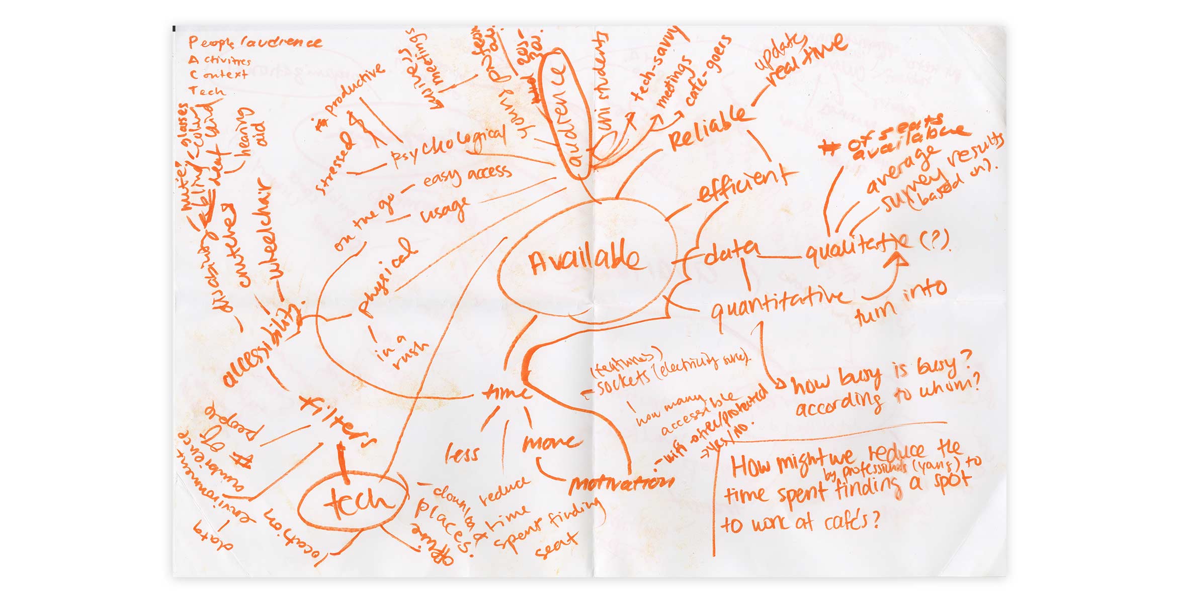
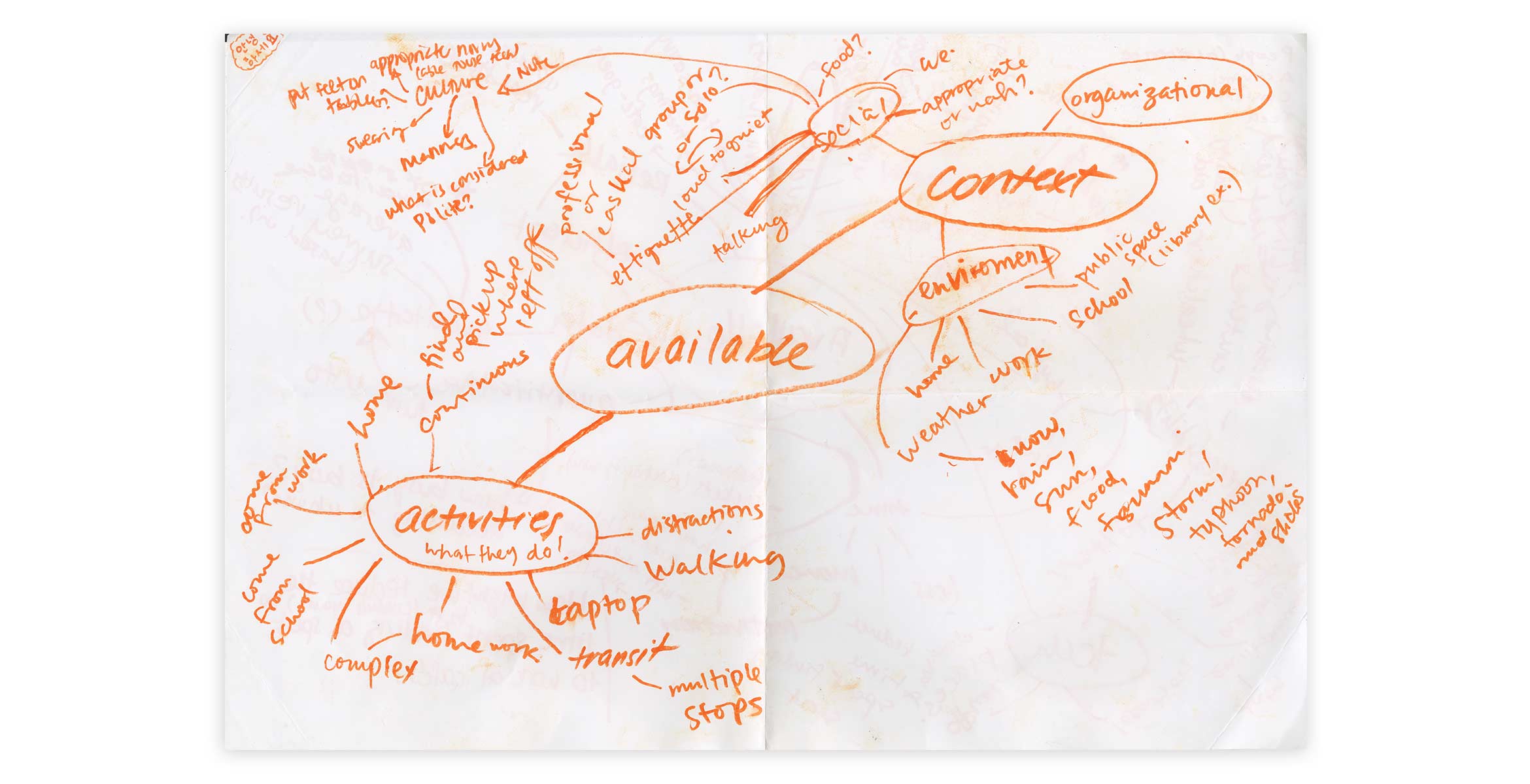
An analysis that reflects on People, Activities, Content and Technology, our team brainstormed and observed to further develop an understanding of our target audience and users.
MOSCOW METHOD
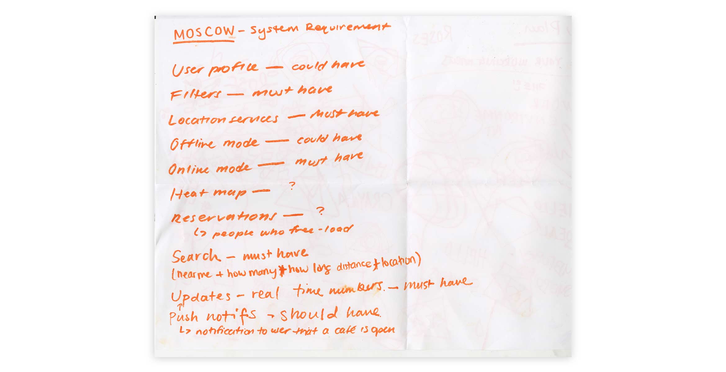
This acronym stands for Must have, Should have, Could have and Would have. The set of questions that this method provides guided our team in determining our app's key features and system requirements.
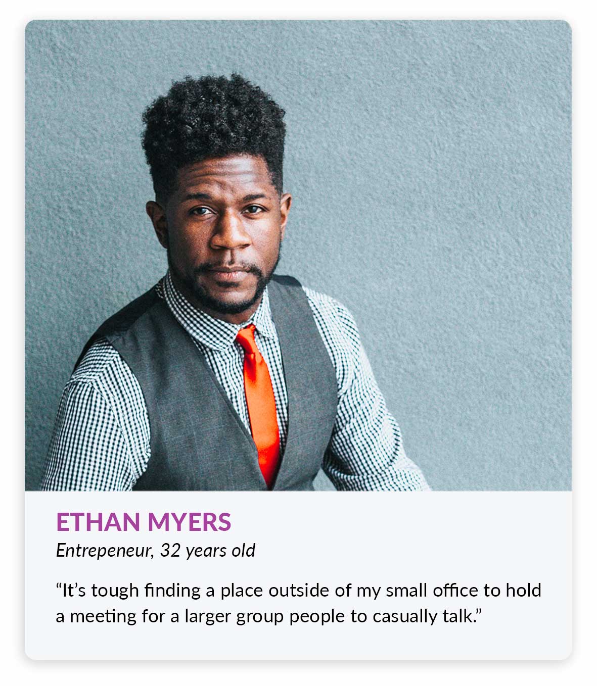
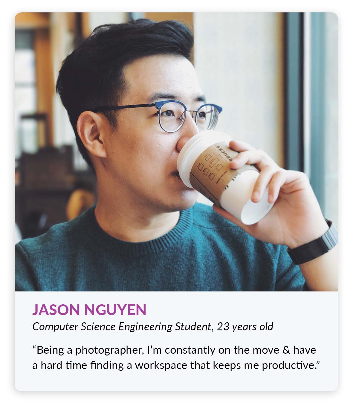
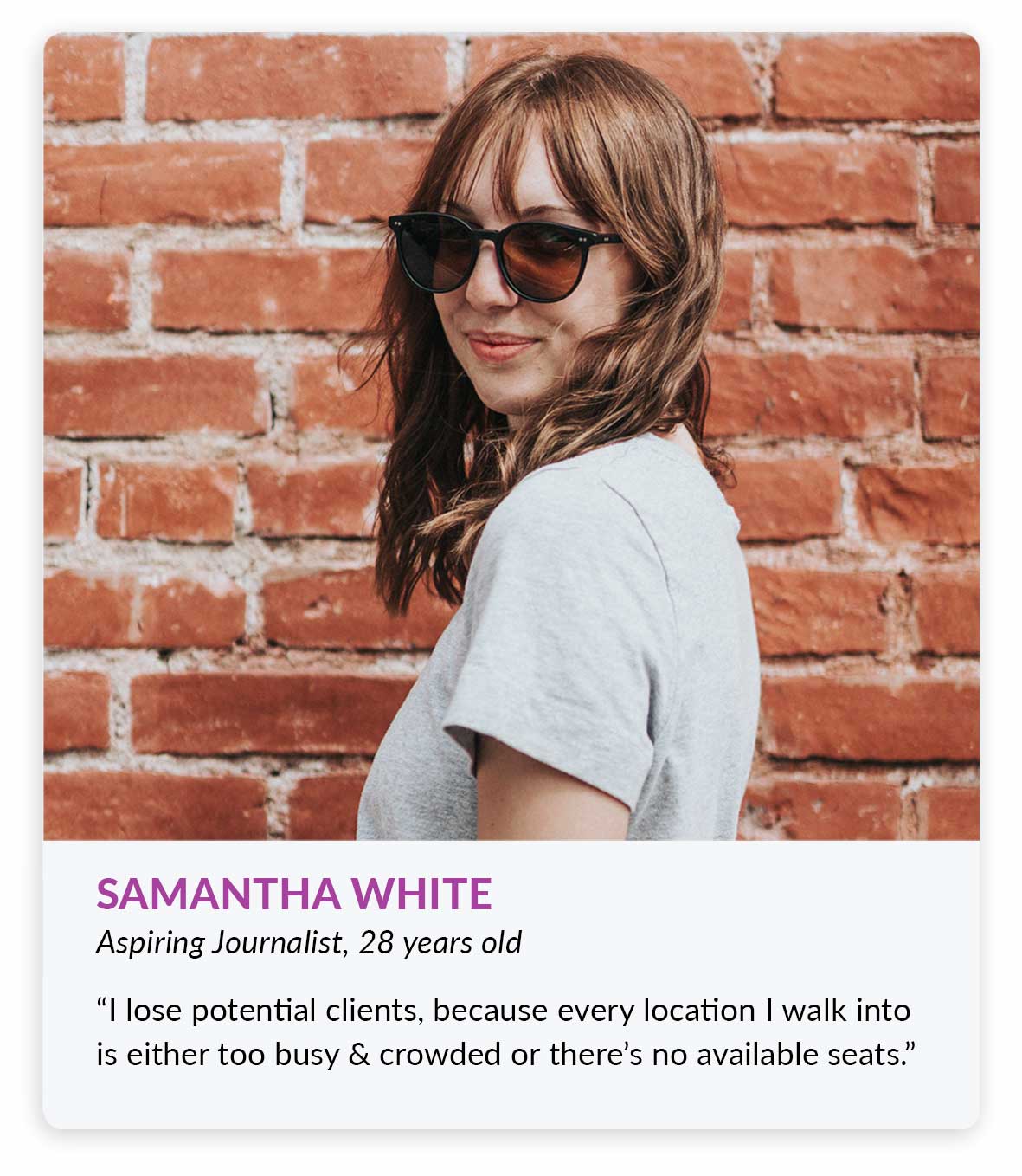
Defining User Personas
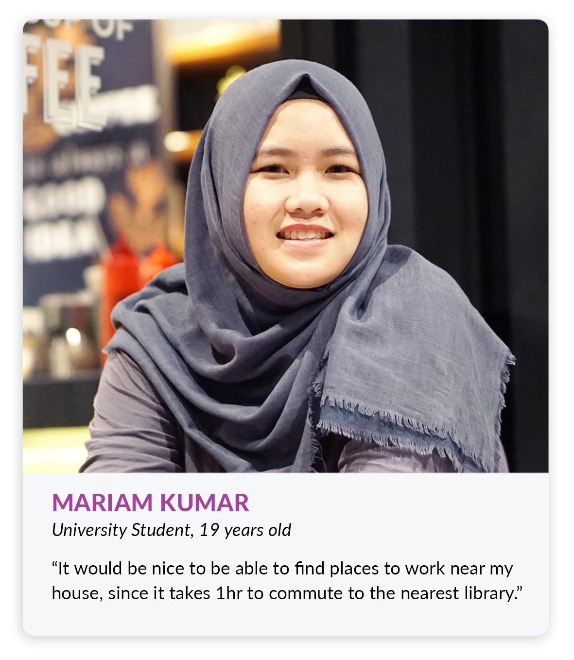
Creating different user personas aided the team to understand the different needs as well as the different range of potential users that would interact with this mobile application.
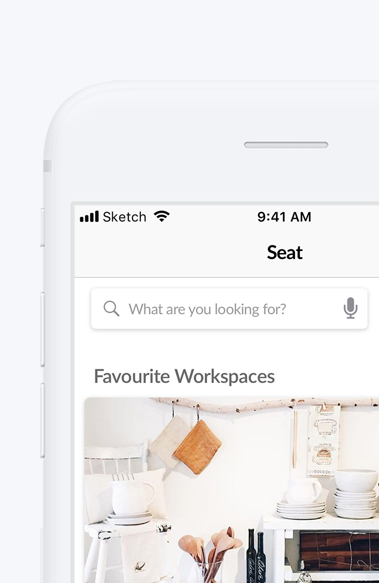
Key Application Features
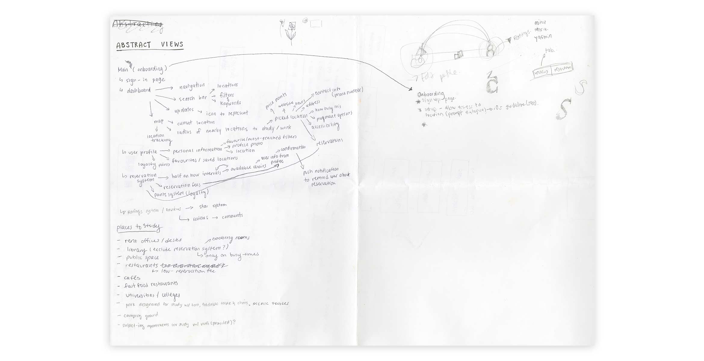
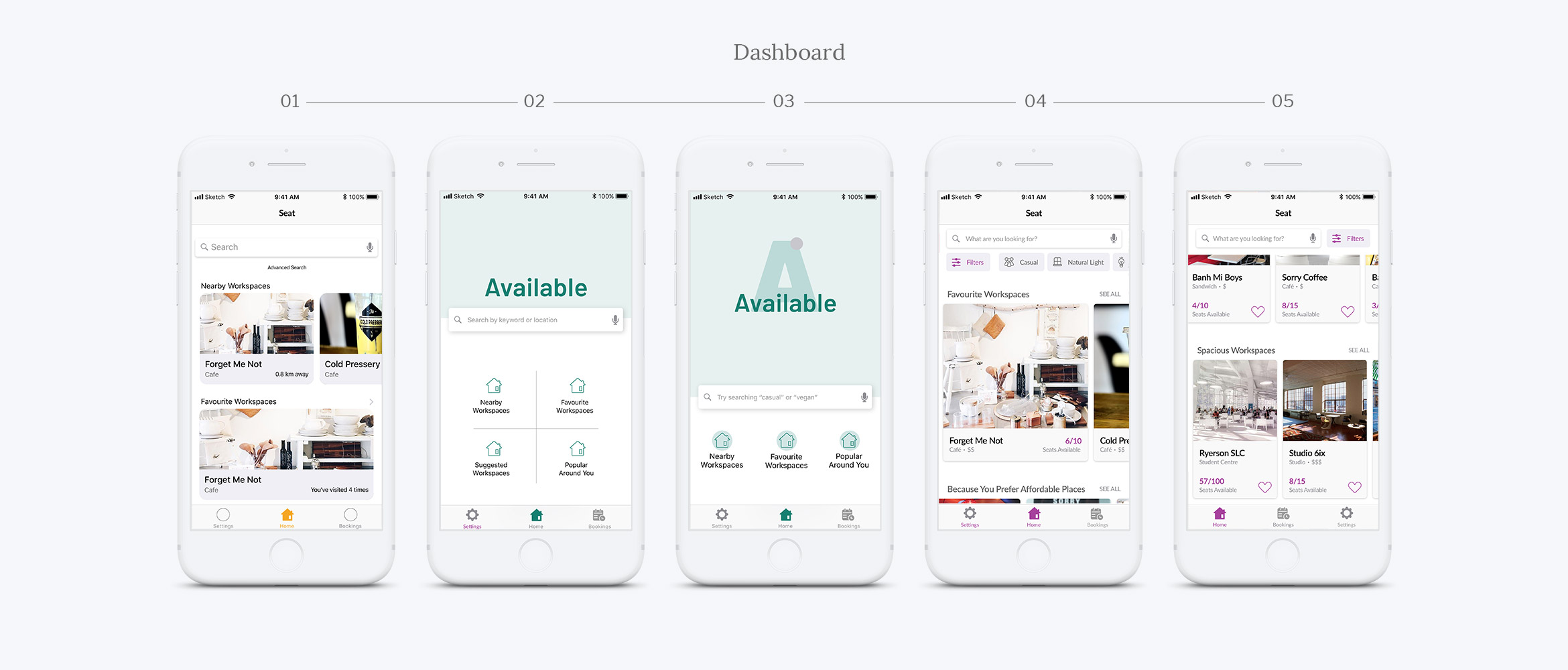
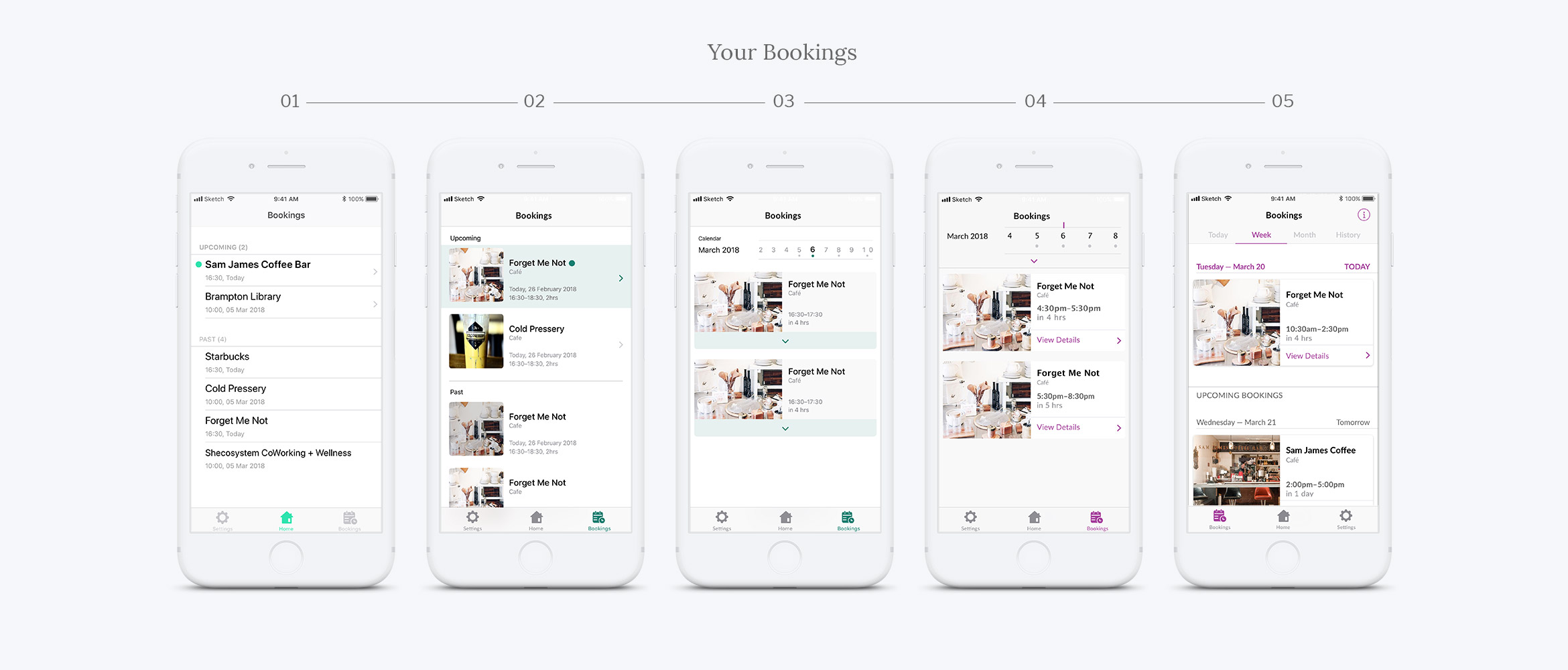
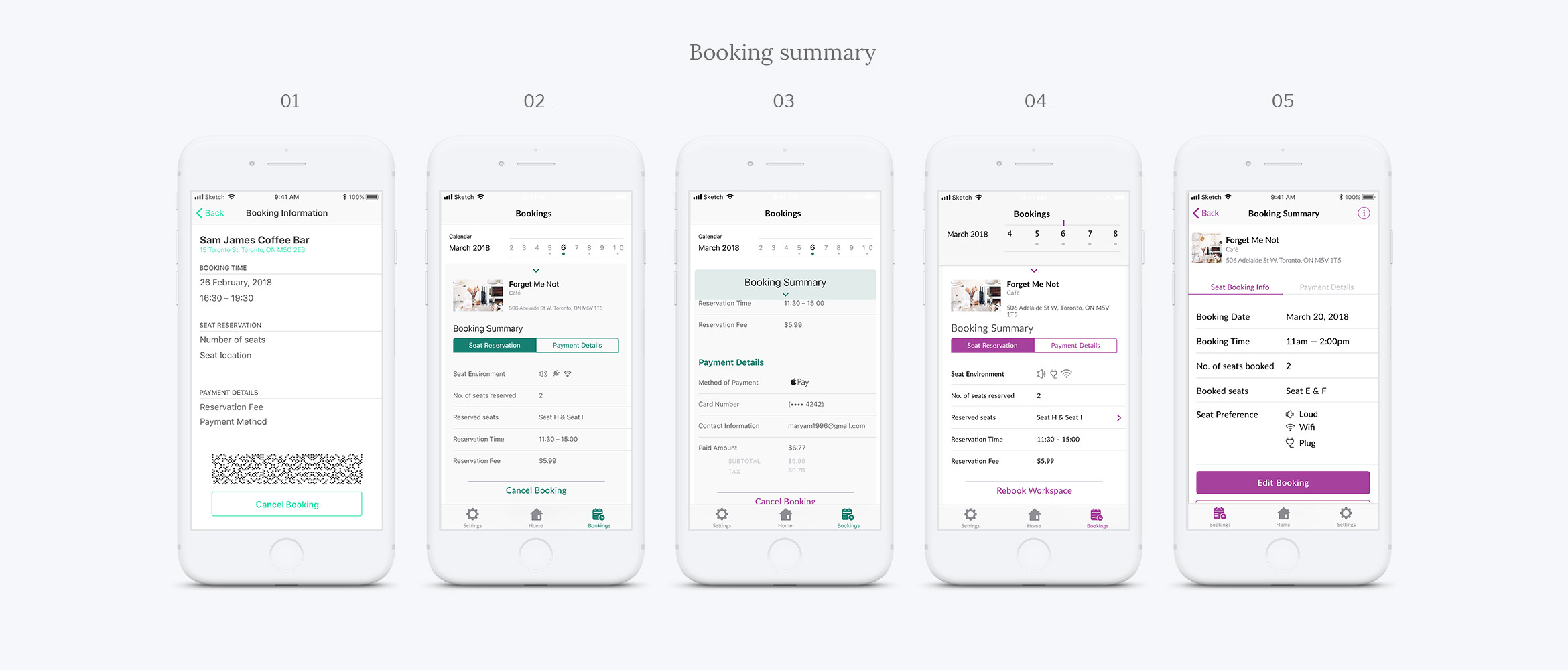
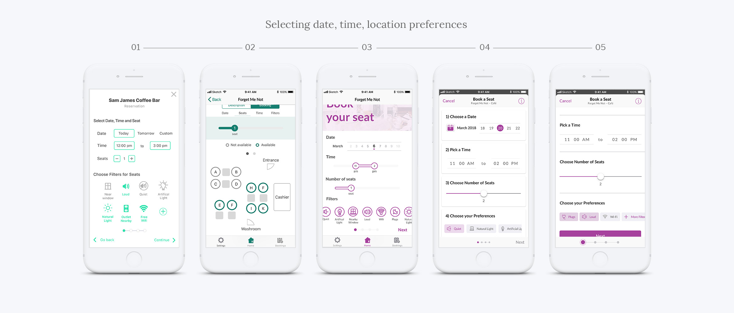
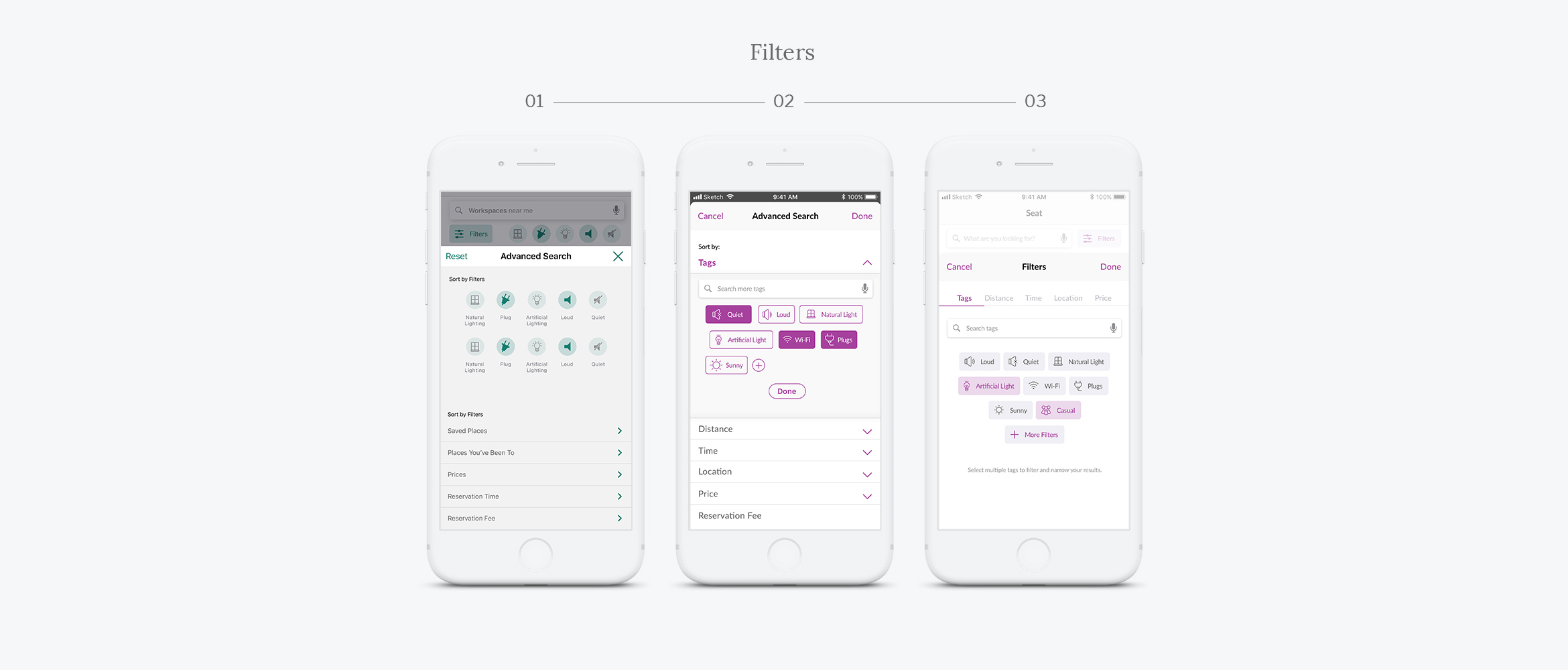
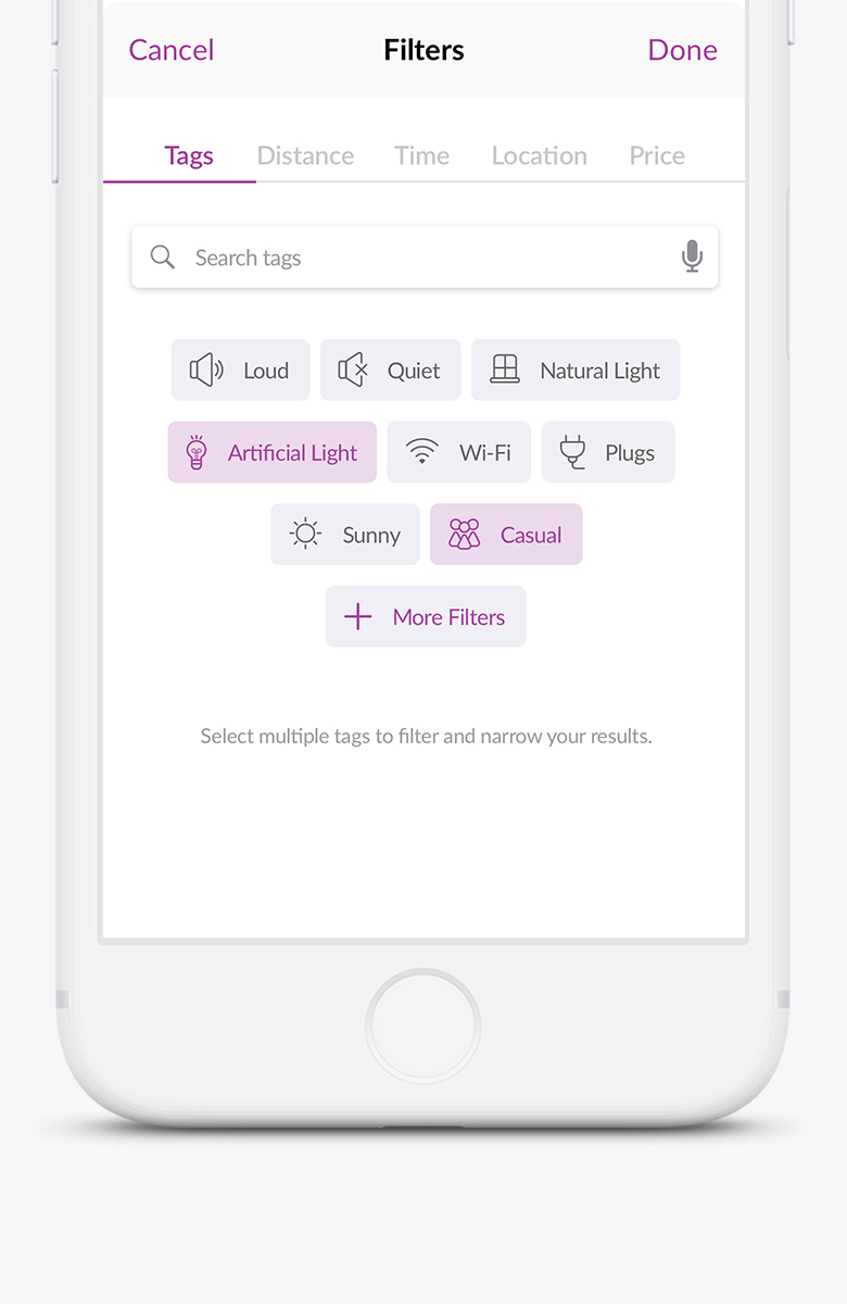
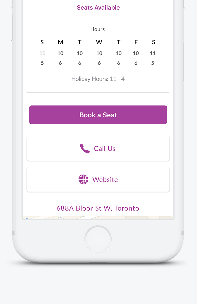
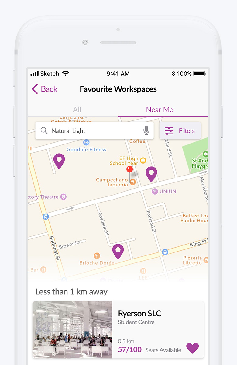
Four main features were determined using the MoSCoW method that define the basic functionality of the app: search, filters, bookings, and favourites.
Visual Design
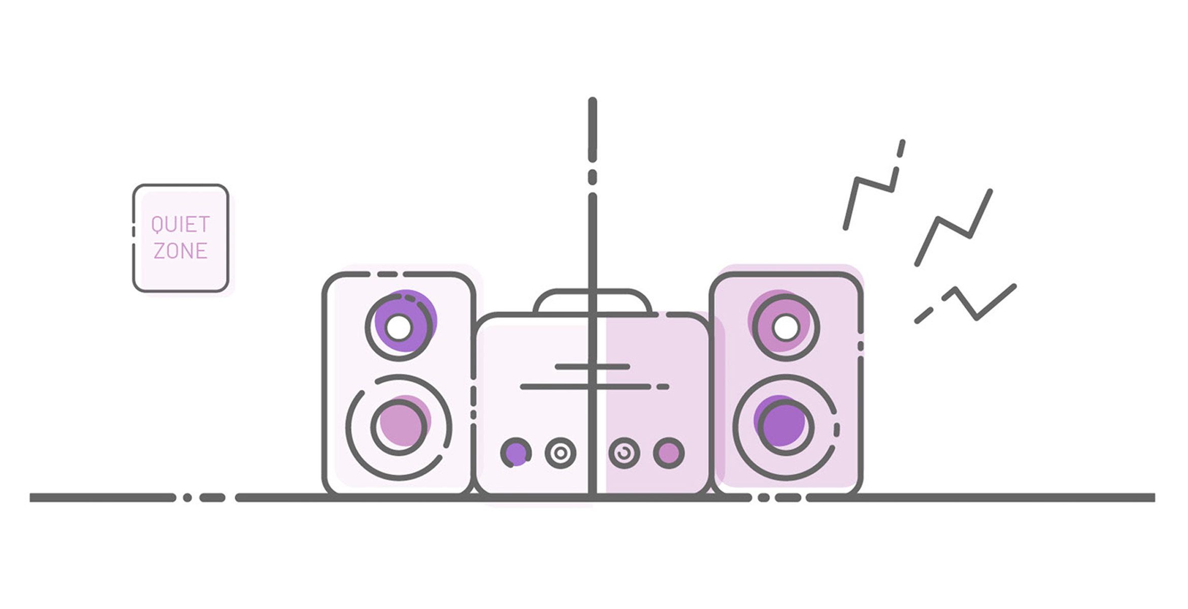
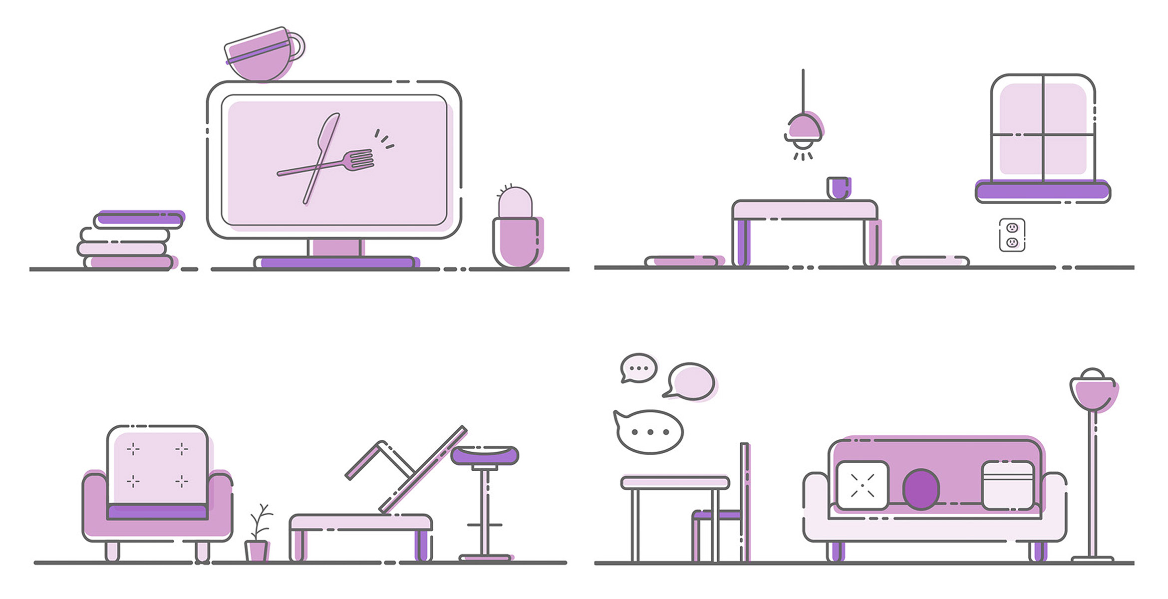
Our team's collective agreement and direction was made possible by conducting visual research, and creating moodboards that varied in visual themes (monochromatic, dark, bright and colourful, and minimalistic).
Based on our visual research and the category our mobile application falls under, we opted for the minimal, clean, and sophisticated visual style. However, the varying visual themed moodboards served as inspiration for designing our group's interface layouts, user experience flows, iconography, and illustrations.
User Interface Design Development
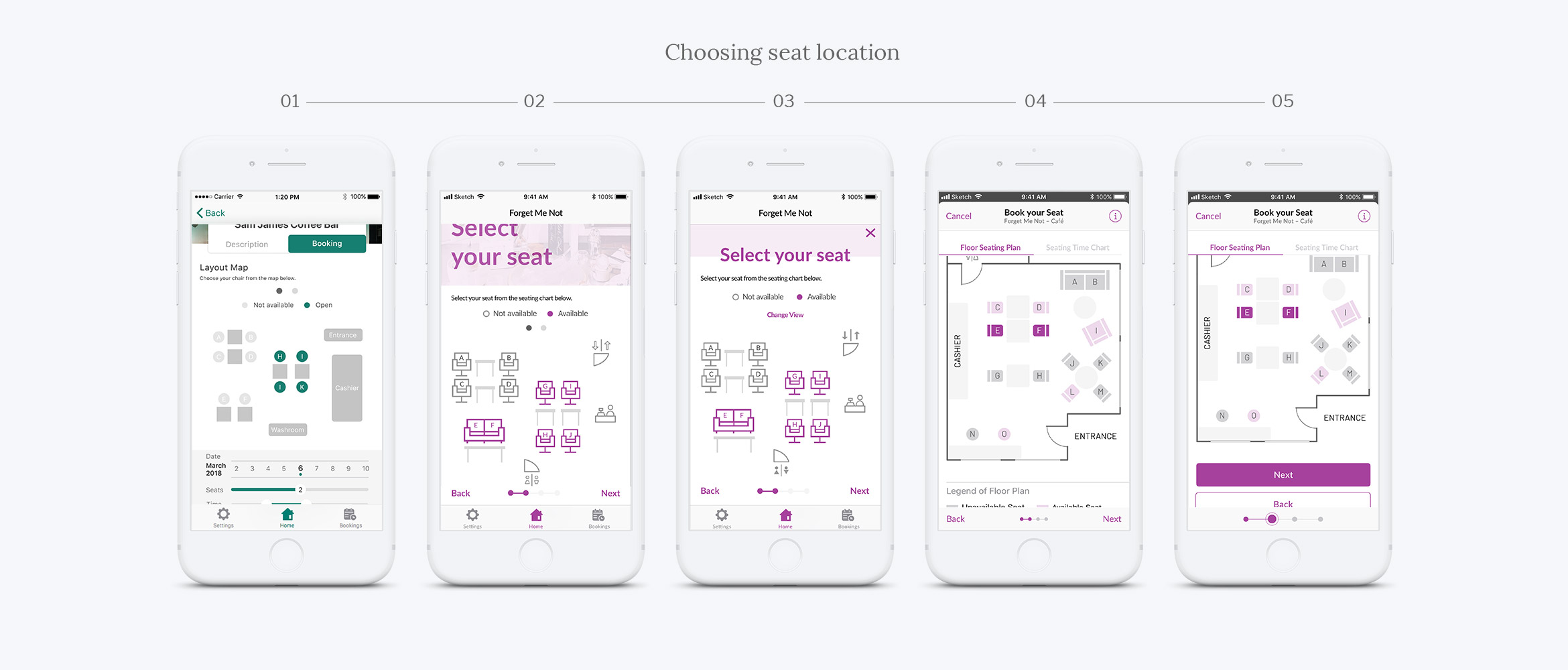
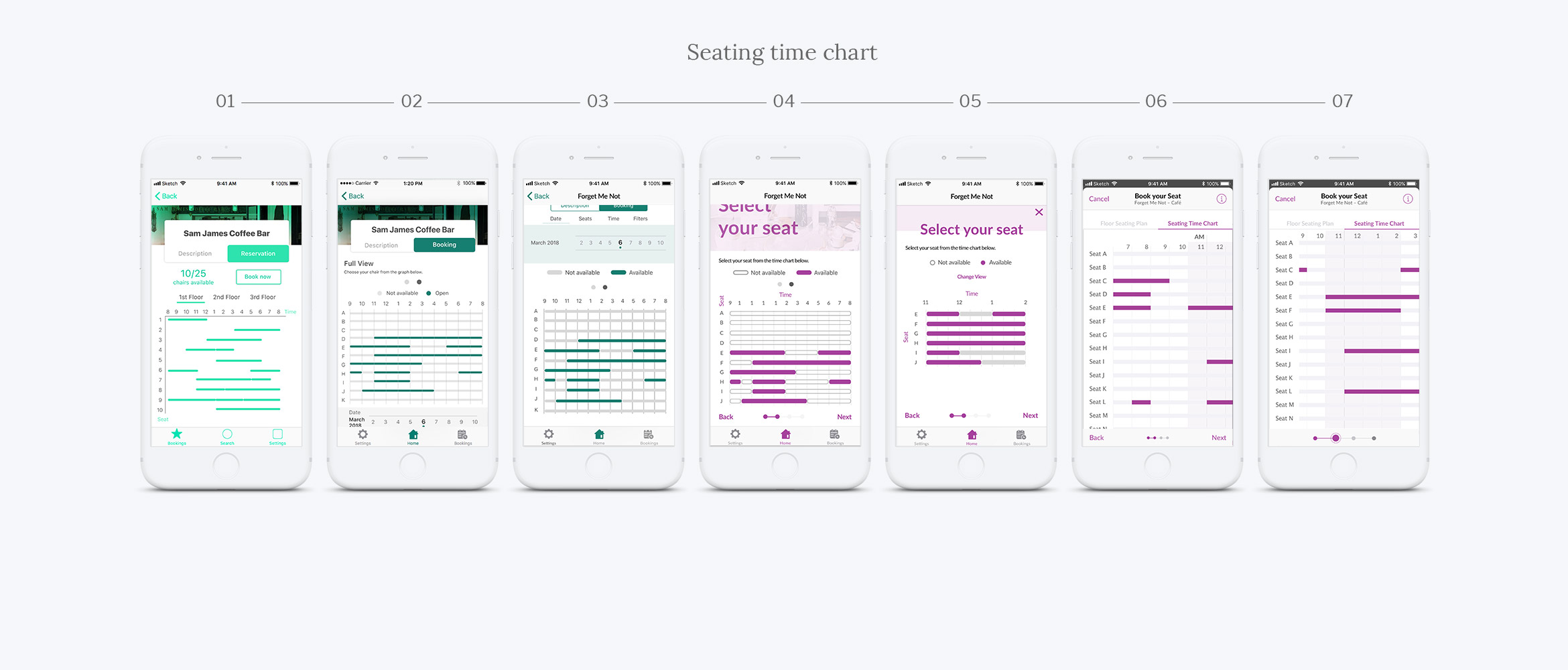
Our app's interface went through many revisions and came a long way from the initial to the final design. Above shows the development of the screens as we received feedback through user testing sessions and peer critiques—number 01 being first draft, and the last number being the final version.
Final Project Deliverable: The Prototype & Feature Video
The final prototype outlines the list of scenarios and tasks determined to test out the main features of the mobile application. Solely focusing on the main features allowed a more streamlined development for the needs of the user, as these features make up the core of the application.
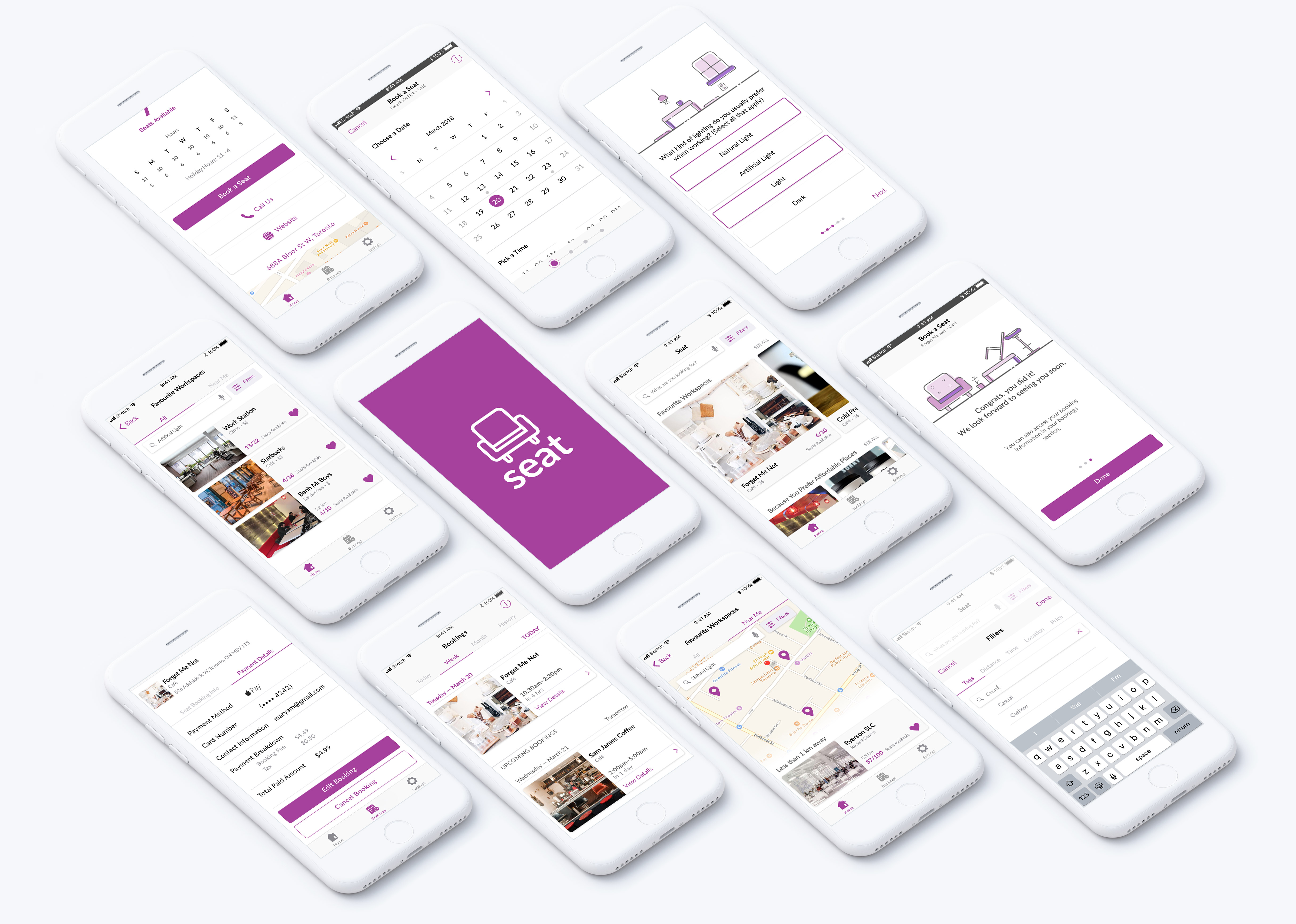
"The solution to search workplaces in public spaces."
© Livia Widjaja 2020
